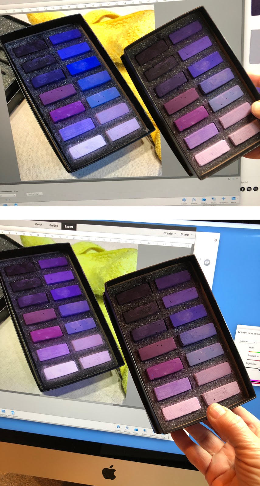
I started today's post with the intention of showing you my beautiful new set of Terry Ludwig 14 favorite violets and talk about a new series of paintings. But, I got side-tracked when photographing the pastels.
I am a stickler for accurate color representation of my art online. I photograph every piece of art with a Kodak color bar/gray scale and I spent a lot of time adjusting the color, value and saturation until it looks correct to me. I know it always photographs too blue but today I think I figured something out...
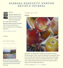
The top photo is me comparing the pastel set to my iMac display. As you can see, the display is way too blue. The bottom photo is much closer and actually looked even better in person than this photo does. Here's the Photoshop adjustment I made to get so much closer. Now, in theory, this should work on any photo I take, right? Note: this is the adjustment for my display, yours will be different.
LATER NOTE: THIS SOUNDED GOOD IN THEORY BUT I'M NOT SURE...


No comments:
Post a Comment