In July of 2013 I painted a pastel on LaCarte paper - a coarser surface than my favorite Wallis. At that time, I wanted a soft look for the painting shown above so it was a bit of a struggle. Today I pulled the painting out and began lifting color off with a hog bristle brush.
Here you can see the color of the paper showing through. As I lifted, removed and added more color, my mind was occupied with good thoughts of my former father-in-law who passed away today. I was painting on auto-pilot. At some point, I realized I was loving this paper!
"Godspeed" is sitting on my easel...I'm thinking about it. And, I wonder if I have anymore LaCarte. For those of you who are not familiar with this paper, you CANNOT get it wet and since I usually work with an underpainting, I have avoided it. Hope I have another sheet in my flat file.
Friday, January 30, 2015
Wednesday, January 28, 2015
acrylic underpainting for pastel
Friday, January 23, 2015
Thursday, January 22, 2015
second trio and goodbye pretty
If you read my posts of January 13 and 15, you saw my pretty reference photo. I've worked with that photo before as a lesson on value but can't remember completing a painting to send out into the world. Now, here I am again, using the same reference photo for the second trio of acrylic paintings. And, once again, I'm losing interest in this pretty scene. Give me wild, unkempt, tangled nature and I'm inspired to paint. The above painting - about 70% complete - is as far as I got before I started gagging on pretty. The other two panels have been painted over, scrubbed, poked and prodded and I'm starting to get somewhere (somewhere I want to go) with them.
Love the top half of this. Just before leaving the studio last night, I took a wet paper towel and scrubbed off the lower half. I'll start on that again today.
This one will probably be a loose interpretation of the pretty reference photo. Back and forth, paint on, paint off. Running from "pretty."
Love the top half of this. Just before leaving the studio last night, I took a wet paper towel and scrubbed off the lower half. I'll start on that again today.
This one will probably be a loose interpretation of the pretty reference photo. Back and forth, paint on, paint off. Running from "pretty."
Monday, January 19, 2015
acrylics to Cole Gallery
Tomorrow I will deliver the first three acrylics of 2015 to Cole Gallery for their annual Anniversary Show. The Opening Party is 6:30 - 9:00 PM, February 7th.
Friday, January 16, 2015
Second Trio Step Two
Here they are again, this time with the darkest value added. I noticed when working with interactive acrylics that sometimes in my enthusiasm, I accidentally lifted off too much value so today I applied varying amounts of acrylic Lamp Black, NOT interactive. And, to keep it loose, I used a rubber spatula instead of a brush.
Thursday, January 15, 2015
a little preparation
Continuing from yesterday...
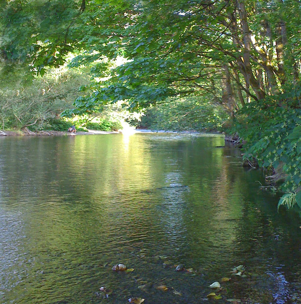
As I started to work on the three little acrylic foundations I posted yesterday it occurred to me that it would be easier to reformat the reference photo from the vertical format to a square. Then, once I started playing with the photo - which, by the way, I am amazed I could actually find in my computer - I couldn't help looking at the composition and values so I used PhotoShop to change the focus of the light to keep it more in the middle. Below is the adjusted reference photo that I will be working from.
As I started to work on the three little acrylic foundations I posted yesterday it occurred to me that it would be easier to reformat the reference photo from the vertical format to a square. Then, once I started playing with the photo - which, by the way, I am amazed I could actually find in my computer - I couldn't help looking at the composition and values so I used PhotoShop to change the focus of the light to keep it more in the middle. Below is the adjusted reference photo that I will be working from.
Tuesday, January 13, 2015
next three acrylics
The next three acrylic experiments are on the easel. Color is arbitrary - brushfulls of paint applied to white Ampersand Gessobord while I was cleaning my acrylic palette. I lifted color off using a paper towel and/or brushes. Also, I misted the first one with water and let it run. These three are starting out as the same scene using a reference photo from September 2011- see my sketchbook entry below. The original painting from this photo shoot of the Cedar River was used as an Art Journal Blog post called The value of value.
Thursday, January 8, 2015
sunrise on our pond
 |
| Faithful, acrylic, 6 x 6 inches |
Tuesday, January 6, 2015
painting with faith
 |
| With Faith, acrylic, 6 x 6 inches |
Saturday, January 3, 2015
Turn, turn, turn
As I was framing "Leap to Faith," I enjoyed the yin/yang of the piece as I rotated it. The balance of light and dark is pleasing to me each way.
Friday, January 2, 2015
Leaping
 |
| Leap to Faith, acrylic, 6 x 6 inches |
I began work on it a few days ago using Atelier INTERACTIVE acrylics on top of the black and white foundation. What fun! I have been able to glaze, wipe off, start again, poke, prod, lift and rub with a cloth to create a little painting of simple shapes and masses and subtle color. I don't know why I have avoided acrylic paint for so long. Well, yes I do know...it was because I want soft edges and I didn't know it was possible to get them with acrylics. The color on this little painting was built in many layers creating nuances of hues and luminosity. I don't think the photo does it justice.
I have been packing up my studio for our spring move and I'm surprised how many acrylic paints I have. After I work with the interactive type for a while and gain more faith in my ability with this new medium, I plan to move on to the regular acrylics simply because I have them. I am leaping TO faith - not scary because I'm painting just for myself without the pressure of shows or gallery commitments.
simplification
I'm going to be working toward simplification in 2015. Simplification in my finished work (simplified shapes and values) as well as in the way I work. In the Spring, my studio and office will be separated. No more tempting dings from the computer when a new email comes in. Yes, I know I could just turn down the volume but it wouldn't work. I would become curious, stop painting and go to the computer and look.
Acrylic seems like a simple medium so I'm trying it. No solvents, easy clean up. Shown above are the three little paintings and my first hour of exploration with acrylic paint. So far, so good. In fact, some nice surprises and glazing and lifting color back off (a favorite technique of mine in all mediums). I don't know where these three little paintings will end up but today, I am hopeful.
Acrylic seems like a simple medium so I'm trying it. No solvents, easy clean up. Shown above are the three little paintings and my first hour of exploration with acrylic paint. So far, so good. In fact, some nice surprises and glazing and lifting color back off (a favorite technique of mine in all mediums). I don't know where these three little paintings will end up but today, I am hopeful.
Thursday, January 1, 2015
Notan
 |
Nōtan is a Japanese design concept involving the play and placement of light and dark as they are placed next to the other in art and imagery.
Subscribe to:
Posts (Atom)


