Thursday, September 5, 2013

step 8 - add transparency

Step 8 - Add Transparency
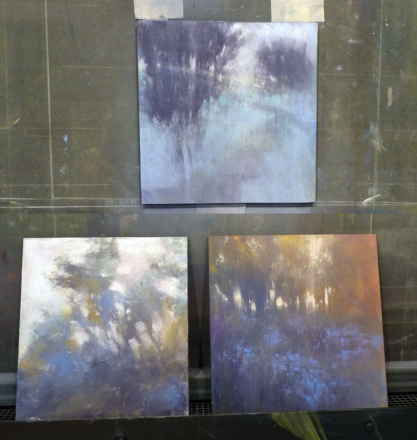
To achieve the look of translucency, I hold my pastel stick so the side of the pastel, not the tip, touches the paper. In a fluid movement, I touch the pastel to the paper and drag. This gives a light layer or veil of color and when used over another color the result can be magical. In this painting, I used two complementary colors, one as the base and one as the veil. Because complementary colors intensify each other and vibrate, the yellow green veil placed over the complementary violet background seems to lift and float, adding depth to the tree foliage. 

Complete the details tomorrow... 

Wednesday, September 4, 2013

step 7 - enchancing the atmosphere


Step 7-Enhancing the Atmosphere

Adding a lavender purple will soften and unify the other colors. I apply pastel veils of color. My marks are strong and direct. I add lavender notes on the ground, and I take a little pigment throughout the stage to create an atmosphere. I reused my light yellow to provide more saturation to the sky.  I use the ridge of a pastel stick to emphasize the presence of trees on the left.

Step 8 tomorrow...

Tuesday, September 3, 2013

step 6 - play with color


Step 6-Play with Your Colors
I have not planned the color scheme of this painting in advance because I do not want to transform the process of creation into a method of production. The relationship between colors is critical knowledge for an artist.  We have to ask: is the purple under the shade of green trees too bright, too extinguished and dull?  Does it deserve adjustment? It is gratifying to find the right color immediately. When in doubt, I test on the margins of my paper.


Step 7 tomorrow...

Monday, September 2, 2013

step 5 - create atmosphere


Step 5-Create an Atmosphere
The mood of a painting is set by composition, color, color temperature and pastel technique. Here, the horizon is slightly above the center of the paper, which balances the composition.  The path must go a certain way.  Surrounding trees emphasize the private aspect of this trip.  If you think about the mood, and if you know your subject and you have a clear vision of the story you want to tell, you will naturally gravitate to the right colors.  I want a calm and serene atmosphere. My first choice of color is a blue-violet.  I apply it generously, as it will have to bear the overlays.


Next step will be posted tomorrow...

Sunday, September 1, 2013

Step 4 - bring dynamism

-->
Step 4-Bring dynamism to the painting
A complete set of values ​​will bring force to your tableau. The lightest value lies in the sky, unless you are painting bright snow or sand.  The second value is the flat ground. Upright rees and shade will be a darker value. I apply my darkest value (dark green brown). I use a gloved finger to blend the pigment. I love working the material with a glove, I have the feeling of coming into the image to work transparency and depth.  I merge the ghost color along the edge of the forest. To establish and confirm the setting, I use a Colour Shaper:  this tool is ideal to draw the foliage, stems and grass. 

Step 5 tomorrow...

Saturday, August 31, 2013

step 3 - define the big shapes

-->
Step 3-Define Volume
I live in an area where the sky is often overcast.  I love these neutral and gray skies, which are made up of many colors.  For this sky, I will push the color toward a light yellow. I apply the pastel quite firmly to cover the colorful area of ​​the ghost picture.  Later, I will return to the sky with the same color, but the color values are strengthened.  With yellow ocher, I place the path, the road, which gives movement to the image.  It is also the narrative element of this tableau, since the story I want to tell will reflect the path I choose to follow. 


See step 4 tomorrow... 

Thursday, August 29, 2013

step 2 - simplify the subject


Step 2-Simplify the Subject
My landscapes are my impressions of a place, not a copy of it.  I do not want to paint every leaf and every blade of grass.  I am more concerned with the emotion of a place than into the realism.  I allow myself to move a tree, create a path. The observation is a starting point, and you have to play on interesting elements of the design to tell a story.  From the moment when my values ​​are defined, I use a flat brush (size 10) that I soaked in a solution of 91% Isopropanol (which dries faster and alters the paper less) to establish large shapes of the composition. I always use old brushes, because the sandpaper tends to damage them.

See step 3 tomorrow...

Wednesday, August 28, 2013

if you don't read french...


 Follow Your Heart  |  pastel  |  10.5 x 12 inches


 This is a reference photo of the scene at Point Defiance Park, Tacoma, Washington.

My painting, Follow Your Heart, was the subject of a recent article for Pratique des Arts magazine. A huge thank you to my nephew Hunter for translating the article into English so I could read it. Over the next few days, I will be posting the painting steps here for you. 

Step 1-Working from a Ghost Image
To reuse the paper from a previous pastel panting, I remove the pastel from its frame and brush the pastel off, or if it is a paper that tolerates water such as Wallis, I wash the pastel off. This cleaning will leave a ghost image that is trace color for the foundation of my future painting.  Inspiration can come from stains that remain after washing the surface.

See step 2 tomorrow...


Monday, August 19, 2013

life changes

It's official. My husband and I finally own property on the lake where we have been looking for many years. With this dream coming into reality, I'll be stepping back a little from my art commitments for awhile. It was so long coming that I want to give it priority for my time and energy. 


if you read french...

I am honored to be included in the No. 111 edition of the French magazine, Pratique des Arts! Of course, I don't speak or read French but I love the way the article looks. If you read French, enjoy.


Wednesday, August 14, 2013

nine


All together now...the nine small pastels from this summer. They are for review first by a collector of my work then some or all will be posted on my Daily Paintworks Gallery in the fall.

Saturday, August 10, 2013

week end

I'm ending the week with "Windmist," pastel,  7.5 x 7 inches. I think that will be the last of these small paintings for a while. The vegetable garden has turned into a jungle and is calling me to weed it.

lush life

This little painting took a lot of work, trial and error, patience and perseverance - a metaphor for life. For my lush life, I am enjoying a can of Coca Cola - I gave up buying it years ago but may start again for my golden years.  "Lush Life," pastel, 7.5x7.5 inches

Friday, August 9, 2013

spinning my wheels

Every once in a while I have a day of "spinning my wheels."

To me, a good day is a productive day. That's a problem. I know that a day of paint on, wipe off is a lesson day and one I won't have to repeat if I pay attention. But chasing the illusive vision for a painting then losing it time and time again is frustrating. The "believe in yourself" advice I give to students is not useful at this point. I finally walk away singing my painting theme song, The Gambler, (a song written by Don Schlitz and recorded by American country music artist Kenny Rogers)

You got to know when to hold 'em, know when to fold 'em, Know when to walk away, know when to run.

Above are the three "wheel-spinners" from yesterday. Before I begin, I'll have a talk with myself about each one. What (if anything) do I like about it as well as what has to go? Is there a story worth telling in this scene? What is the mood? Today, I'll try to listen carefully to each painting and be thoughtful in my response.

Tuesday, August 6, 2013

the same but different

Same colors but in different combinations and amounts. This is Afternoon Passage, pastel, 7.5 x 7.5 inches.

backlit, tree-lined memories

To continue my post of yesterday, a backlit tree-lined hilltop has emerged. Apparently there are many backlit scenes in my memory.
"Fond Memories," pastel, 7.5 x 7.5 inches

Monday, August 5, 2013

mind's eye painting


You may know that I have a habit of washing off pastel paintings and reworking them from the ghost-image up. This time, I cut up an old painting to make four small paintings.

I love the color palette of the original painting but to use those colors, I have to find the actual pastel sticks again. It's trial and error by sampling color on a piece of white paper. When I have a color match, the pastel stick goes into a small container. The next step is to brush off as much of the color as possible from the original painting. This leaves a ghost-image.

I have no idea where the reference photo is for this scene of our driveway but I am spending these weeks painting from memory so I don't need it. The scene that I paint from my mind's eye may look quite different from the driveway or the ghost-image.

I have blogged a little about memory or mind's eye painting and will continue to do so but my friend Tom Weinkle saved me a lot of typing with his clearly written post today (August 4) about planning a painting. The way I am painting now is one step further away from planning. It is more about discovery.


http://tomweinkleartist.blogspot.com/

Saturday, August 3, 2013

my new pal?

Here's a shot of my new plein air pal...the Pastel Porter. It arrived yesterday (an award from the recent PSWC show). I had a chance to chat with the creator at the IAPS Convention about his entire product line. This Jumbo Junior size looks like a great way to transport pastels for plein air work. I look forward to trying it!

Thursday, August 1, 2013

one fine day

The days following my Landscape Impressions workshop were spent with my two grandsons (ages 11 and 13) to make a busy, fun summer week. I have finally had some time to reflect on the workshop and on each student and what I hope I contributed to their art journey. This morning I received a very nice email.

'I loved the workshop.  I finally figured out what your paintings remind me of: haiku poetry.  They are a fleeting, perfect moment that was experienced held forever in mind's eye!!' 

What a nice thought. I will keep that in mind when I am in the middle of a painting challenge.

One of the most important things I took away from the workshop is the need to believe.  Believe in yourself; believe your work is evolving at exactly the right pace for you. Of course, it is difficult for your work to evolve if you don't paint. Paint every day.

Wishing each of you One Fine Day. (above, pastel, 7.5 x 7.5 inches)

Wednesday, July 24, 2013

two days of fun

Five artists joined me for my two-day plein air pastel workshop, Landscape Impressions 2013. We had gorgeous weather for what might become an annual event - it was fun to teach again. Click on the above image to see two students hard at work. Below is my demo from the first day, tweaked extensively that night back in the studio.

All Things Good and True  |  pastel  |  7 x 7.5 inches


Thursday, July 18, 2013

summer morning plein air

Warming up for my Landscape Impressions workshop next week. The first step is an acrylic underpainting.
Pastel painting of our little pond...the IMPRESSION of our pond.
"Summer Morning," pastel, 7 x 7.5 inches

Wednesday, July 17, 2013

bye bye reference photos


My last post was about painting from memory. The painting above left is a memory painting; the one on the right was painted from a reference photo. Is one method of working more valid than the other? I'm excited about what happens to a scene that has been processed through my memory. This morning, I found an appropriate quote (funny how that happens).

"I never succeed in painting scenes, however beautiful, immediately upon returning from them. I must wait for time to draw a veil over the common details." 
-Thomas Cole


Thursday, July 11, 2013

one happy week

This week I painted from memory. No reference photos, no plein air painting. It was freeing and exciting and was reminiscent of the year or so I spent on abstracted work. Very fun.  I focused on the nuance of a memory-scene and stopped before my usual addition of details. The photo above will give you an idea of the paintings (sorry about the reflections, especially on the center one).

I found a way to trick myself into stopping before the urge to add detail takes over: I selected four older paintings, and each day I took one of them out of its frame, repainted a scene from memory, stopped BEFORE I felt I was done and put it back in the frame. My thought was that I'd just look at them for a while then unframe them, paint a little more and photograph them. However, once one was framed and I went on to the next, I began to forget what I was going to "fix" and now I'm happy with them just the way they are. Certainly happier than I would be if I had overworked them.

Today's painting, "Bejeweled," was a different story. I painted it once yesterday, wiped it off. Painted it again this morning, began to photograph it, then fixed one little thing...then another...wiped the whole thing off and painted it again this afternoon. Now it is sitting in the frame while I think about it.  If it survives, I'll post it soon. I've had a happy painting week.


Tuesday, July 9, 2013

shades of summer

Good days in the studio! I think I have a "nuance" series going on here in pastel. Minimum detail - loving it.

Saturday, July 6, 2013

play day

More playing in the studio. Another 7.5 x 7.5 pastel in cool colors on a warm day.  Soft focus, loose, interpretive with minimum detail.

Friday, July 5, 2013

Journey By Heart


To fill requests of the galleries who kindly represent me, the first half of the year has been spent painting more of the kind of work they have been selling for me.

But these days, I'm painting for myself in preparation for a two day workshop here in my Studio July 22 and 23. By the way...a recent cancellation has made room for one more student. If anyone is interested, just email me. We'll be painting in pastel, plein air I hope, depending upon the weather.

For the rest of the summer, I'll be painting the more impressionistic work I love - more fluidity, less detail. Several years ago, I loosened all the way up to abstracted landscapes and that was fun! For now, small pastel studies (and an occasional oil) so I am prepared to give students my best advice for lively work of their own.

Journey by Heart is from memory...no reference photo to tighten me up and nail me down to specifics.

Monday, July 1, 2013

long time passing

After early-morning watering of the flower gardens and blueberries, I closed the windows and doors against the heat and spent the rest of the day in the studio.

The colors of this painting kept me cool all day. There is a backstory here that I hope to share in a future post. An overgrown driveway not used for years and still lush from pre-summer rains; the tentative title of this one has been replaced with "Long Time Passing," pastel on Wallis paper, 20 x 16 inches.

forgotten

An early start in the studio this morning on a new pastel, tentatively titled "Forgotten." Shown here are the two steps of the under-painting in oil on Wallis sanded paper, Belgium Mist. The painting will be 20 x 16 inches.


Saturday, June 29, 2013

a little help from my friends

I usually schedule work for galleries and shows using my computer database but when I have several galleries to rotate at once, it gets confusing. This time, I printed glossy color thumbnails of each painting to help me quickly see how a group going to a gallery will look.

Our grandsons, ages 13 and 11, stayed with us last week and helped me in the studio one afternoon. We hung the pieces for an upcoming show on one wall for a preview. The cool blues and purples of the pieces should be a welcome sight for the August show if today's temperature of 84 degrees continues.

We also rotated work at one of my galleries and I was happy to have the boys with me to carry paintings. Of course, this is the one time I got a parking place right in front of the gallery instead of the usual two-block hike up and down a hill!

When we reorganized my inventory, I identified several paintings for rework. For these paintings, one boy measured the window and the frame and the other one wrote the information in a spiral notebook. We wrote a big R for "rework" on low-tack tape to label the edge of the frame that shows in my storage area.


Now, the boys are gone and I'm ready to get back to work in the studio. I hope to get some early morning plein air work done this week and will begin to take reference photos of the gardens and surrounding landscape for my July workshop here in case it rains.

Tuesday, June 25, 2013

PSBC Collection


One of the highlights of my summer will be the installation of six of my paintings (four pastels and two oils) at the Puget Sound Blood Center Lab in Renton, Washington. I am honored to be in their Collection of original works. Many thanks to Cole Gallery.

Thursday, June 20, 2013

revisiting sunfall

A couple weeks ago, I helped install "Sunfall" at the Puget Sound Blood Center Lab in Renton, Washington. This week I started a similar version but larger this time, at 20 x 16 inches. This first step is the line drawing in charcoal on Belgium Mist Wallis sanded paper for "Sunfall II."
Next, a thin oil-wash foundation.
 The finished painting, "Sunfall II."  A more colorful version with bolder marks.

Wednesday, June 19, 2013

a long time coming

I was selected for this book so long ago that I forgot about it until today when I received notice that it can be pre-ordered at Amazon or Barnes & Noble now. I don't see myself on the cover but I'm happy to have my work included inside.

100 Artists of the Northwest. The works of 100 contemporary artists interpret and provide a fresh look at the artistic vibrancy of the Northwest region of the United States. The states of Oregon and Washington are rich with artists, having become vital art scenes in the past several decades. Using sculpture, glass, oil, clay, wood, and other contemporary mediums, as well as paint, these 21st century artists combine, redesign, and transform their materials into pieces of works that change the way we perceive both the regions of the Northwest and the world. With a guide to galleries, sculpture parks, museums, and schools, this book is a wonderful resource for lovers of all art mediums.
  • Hardcover: 224 pages
  • Publisher: Schiffer Publishing, Ltd. (December 28, 2013)
  • Language: English
  • ISBN-10: 0764343122
  • ISBN-13: 978-0764343124

Tuesday, June 11, 2013

Can you spell Albuquerque?


I'm not a fan of traveling...a day spent at home in my studio is the norm for me but it is my favorite place to be. When I received notice last year that I had earned acceptance into the Master Circle of International Association of Pastel Socities (IAPS) I was honored, but my second thought was uh-oh because I knew the IAPS-MC medals were presented at the Convention that takes place every other year in Albuquerque, NM. So, like it or not, it looked like I'd be traveling.

I'm back now and this truly impressive medal is with me in the Studio. I'm so glad I went and of course, I'm so glad to be back. The Convention is a big party with all the rock-stars of the pastel world there. I had the opportunity to meet artists I'd previously known only via the internet and also to reconnect with old friends. It was extra special to have served as one of the three Jurors of Selection for the 22nd Juried Exhibition. The art in that show, as well as the work in the Second Master Circle Exhibition, was outstanding.
Old Town is charming, colorful, and funky. We took a walking tour that was fun and educational and we enjoyed the morning warmth but avoided the afternoon heat. Lunch at La Crepe Michel (twice!) was a highlight as was the twisted lemon ice cream cone from a nearby shop. I'm looking for a window or door to paint Virgin Mary Blue, preferably West-facing to ward off evil. And, if not for this honor, I might have gone my whole life without knowing how to spell Albuquerque!

IAPS is made up of pastel societies from around the world. Find a pastel society near you.

Monday, May 27, 2013

the same but different

In the summer of 2010, as an experiment, I painted the same scene twice. The first painting, "Summer Sojourn," went to a gallery and on to a new home. It is also published on page 211 of my Art Answers: Pastel book.

Today, I brought the second version out of storage. "Summer Sojourn II" was an experiment in process vs product and has some exciting foundation work showing through the pastel. Click on the title above, then click on the image and see the upper right corner.

I started to unframe this painting to post it on my Studio Sale blog for the month of June but halfway through I thought, why not just sell it framed? Image size 9x8, frame size 15x13, Nielsen German Silver metal frame with white archival mat and glass. For purchase information, click on the Studio Sales link in the sidebar.

Friday, May 24, 2013

backstory on my book

Yesterday, I received the first copies of my book! It was a unique project with my part completed in record time.

One morning in mid August of last year, I made a new folder for my computer desktop labeled "My Book." I had been thinking for some time about self-publishing a book of my work with a few step-by-step demonstrations. In the folder, I filed links, ideas, and images of my work. Within 30 minutes, I received an email from Quantum Publishers in the UK asking if I would be interested in authoring a pastel book for them! I just sat in awe, looking at that email. I wasn't familiar with Quantum and I still don't know why they contacted ME. But, I was happy that they did.

It sounded like an interesting project: Quantum has published pastel books in the past and they wanted someone to compile text and images from existing books into a new book for their series called Art Answers. I needed to come up with 200 questions about pastel in 30 days. I could do that!

Very quickly, I learned that not only did I have to submit the questions BUT ALSO THE ANSWERS in that short time period. Quantum air-mailed the existing books to me and I began to work on this huge puzzle: first, start with one of my questions, then read through four existing books and answer the question by combining existing text and images for artists in both the UK and the US. I also wrote new text illustrated with my images for many of the questions.

I love this little book! From the four existing books, I had the opportunity to include previously published images of artists whom I admire - Sally Strand, Kitty Wallis, Doug Dawson, Jackie Simmonds, Carole Katchen and others.

I was also able to give a shout-out to Artist's Air and Paula Ann Ford on page 45 for the question, "Are there health concerns when using pastel?" and to introduce Terry Ludwig Pastels to UK artists.

While typing this post, I have gone through the book page by page. I must point out that this is a book of information, not a book of beautifully reproduced images. The color of my paintings in this book motivates me to return to the "My Book" folder to self-publish a book!

Many thanks to the folks at Quantum and Barrons for this opportunity. Purchase Information.


Wednesday, May 22, 2013

young at heart completed

May 10th, I posted "Young at Heart" in progress and after 12 days of painting and pondering, I'm calling it done. 24 x 24 inches, oil on wood panel.