Monday, April 30, 2018

Block-in for doubled daffs

These doubled daffodils popped up in one of my pots. They are unlike any daffs I've had before so I cut them and took some still life reference photos. This is one of the compositions. I thought I would get around to painting them before they wilted and shriveled but I didn't get around to it. So, I'm going to have to paint from the reference photo.

Here's my block-in from yesterday. I took into consideration the photo distortion of the bowl so made that correction but I left the Studio last night knowing there were more adjustments to be made.

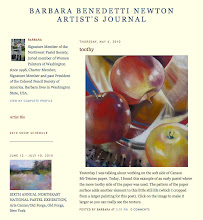
 So, today I "painted" with the Photoshop Elements clone stamp to correct somewhat for the distortion of the flowers being so big because I was shooting from above them. Another proportion change is adding to the heft of the vase. I still like the flowers leaving the picture at the top. Took the lime out of the bowl and set it beside...and on and on. Just discovered something else: If you paint with small brushes you will get a labored, detailed look. For that juicy-oil, painting-with-abandon look, paint in Photoshop with a large size clone tool. I love the look of these strokes in the photo made with the clone tool.

Saturday, April 28, 2018

Color Bar and Words of Love

Words of Love, oil, 24 x 24 inches
©2018 Barbara Benedetti Newton
If you follow me on FB or Instagram you have seen my weeks-long adventure painting S L O W L Y as I posted the painting in progress. Today I am done (simply because I cannot stand to paint on it another minute). After completing a painting, the first thing I do is take a photo of it with a Kodak Color Control Patch included in the photo. This helps me correct the color on my iMac display.


I tape the color bar to the side of the painting so it shows in the photo, take the painting outside to a shaded area and take a photo with my iPhone. Back indoors, I bring the image up on my iMac and enlarge it to the point that the color bar looks the same size as the actual one in my hand and I compare the colors. In Photoshop Elements I adjust each color separately as needed. In this case, the yellow on the screen needed more warmth to match the color bar in my hand. The green needed to be darker, the cyan needed more green and darker and the blue needed to be warmer (more purple) and a little lighter. After those adjustments I saved the jpg and noted it as "Color Corrected."

Next, I compared the color corrected version to the original photo. In this case they are very close but I decided to use the color corrected one.
Color corrected photo is on the right.

Monday, April 23, 2018

Neutral palette, detail of painting in progress

For years I have been trying to appreciate the patina on my oil palette but finally decided it just confuses me so a few nights ago, before leaving the studio, I painted my palette gray with acrylic paint. In the morning, voila! a nice neutral surface to mix color upon.

 
Last week I delivered four flower paintings to Attic Gallery, Camas, WA for their invitational flower show. Now I'm working on a 24 x 24 inch floral still life on wood panel. Love this surface. Trying to paint slowly with thoughtful values, marks and colors. It amuses me that I began making fine art with colored pencil - a super slow medium the way I wanted it to look. Then pastel...very fast! Now working in oil but trying to  s l o w  d o w n.

Here's the painting-in-progress and a detail shot. I got tired of painting flowers so I moved on to the blue glassy baby. I received my training in making something look like glass when I illustrated perfume bottles for a major Seattle department store in the mid 1960's. Very fun. This time it is a blue glassy baby. Back to the flowers tomorrow...or maybe the cherrywood fireplace mantle.


Friday, April 20, 2018

Open Studio Spring 2018

Thanks to all who attended my Open Studio sessions this Spring. Today was the last one and we had a great time as usual.


Now, it is time to garden!