Friday, May 29, 2020

Double check and Ruby Violet Light

A couple things today:
Double checking my painting
Discovery of Ruby Violet Light


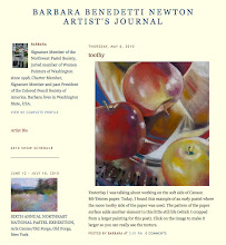
Last night when I left the studio I was thinking "Studio Garden" was almost done. I liked it. This morning I took a photo of it and with Photoshop Elements, placed it next to the reference photo. Oh, oh. Not done. I used the pencil tool with red to mark areas to fix.
1. Shape of tree left side (add sky)
2. Bring the dip of the sky above greenhouse up higher so it doesn't point so obviously to greenhouse.
3. With a rigger brush, straighten some areas on top of the fence.
4. Important area in fence (square) needs grass.
5. Extend the flowering chives up on left to lead the eye to the center of interest (Rhodie)
6. Darken and finish painting upper right
7. Darker values in brick walkway

Comparing the art to the reference is fun. Every once in a while I think about offering this service to other artists. Sort of a Critique/Mentor/Advice role. Contact me if that interests you

Vasari oil paint is wonderful! I have about a dozen tubes still in their felt-lined shipping boxes. Today while mixing color for the flowering chives, I wondered if I had a tube of anything to help me. Voila! Vasari Ruby Violet Light. Great color used alone and so useful to tone down other colors. Not too warm, not too cool. Love it!


Monday, May 25, 2020

Painting the Studio Garden, Post 1

These days, while self-isolating, I've been spending mornings in the studio and afternoons in the gardens (flower and vegetable).

I've been painting small since last November so it feels good to bust out and paint 24x24. That's the short story.

Here is the maybe more than you want to know backstory.
Exactly two years ago I was painting flowers. See the very light Percy Wiseman rhododendron out the window? I was painting that. On this 24x24 inch wood panel. It was going well - until it wasn't. At some point I made the decision to ask Jay to sand the whole thing off. I think it was something about starting with a smaller vase (you can see it in the sanded photo) then reworking that, then something about the background temperature.


Looking back at it now, I think I was hasty. But I am happy to turn the panel into this studio garden painting.
Studio Garden, day 1 The Block-In

Studio Garden, day 2 Double Check Composition

Studio Garden, day 3 Working the Middle Ground


Sunday, May 17, 2020

Need an Ellipse Check?

So....I'm working on a painting with three Glassybabys. (I Googled "What is the plural of Glassybaby?" and got nothing. You know what I mean - there are three of them in my painting).


I'm basically done with the pink one (BFF) and the blue one (peace) and am about to start on the one in the foreground (lavender). I needed an ellipse check for lavender so I took a photo of my painting, cropped it to a detail shot and selected the ellipse tool in Photoshop Elements.

I put the ellipse tool on peace and copy/pasted it. I moved the pasted copy to lavender and because lavender is closer to the viewer, I dragged the ellipse tool to be wider and deeper. Looks good to me, now to paint it. Ellipses are critical. You can lose the edges, even a lot of them, but the underlying foundation has to be correct or... OR IT'S NOT. Always double check your ellipses.

Friday, May 15, 2020

Kodak Color Bar


Kathleen emailed me to ask about the color bars in my last post. I have added a new label to my Art Journal blog so you can search by "Kodak Color Bar." A post from April 28, 2018 will come up with further explanation.

When I photograph a painting, I place the color bar next to the work and shoot both together.

Back at my computer, when I bring up the image on my screen, if the color bar on my screen looks the same color(s) as the one I hold in my hand. I know the color is correct. No adjustment needed. 

If the color bar on the screen is too dark, I lighten the photo that has the too dark color bar in it. Too blue, adjust the saturation, color, etc.. I adjust it until the color bar on the screen matches the color bar in my hand then I crop the photo to the artwork (crop OUT the color bar). Voila!

Thursday, May 14, 2020

Paint Along May 2020 - Oil, start to finish.

If you follow this blog, you have seen previous posts about this Paint-Along I began using a friend's reference photo of the blossoming tree in her back yard. 

She usually works in acrylic but wanted to learn more about oil paint so we began the painting with an acrylic foundation while waiting for her shipment of oils to arrive. If you search labels for "Paint Along with Me May 2020" all posts should show up to show how we started as well as the reference photo I used.

When the oil paints she ordered arrived we moved on to painting with oil on top of the acrylic foundation. Note: I use a medium called Archival Odorless Lean with my oil paint. As I mix a color, I dip the tip of my brush in a little medium and mix it in. It makes the paint dry faster and I like the change in viscosity of the mix. 

Here are the steps of the oil painting with the completed painting at the bottom.

On the acrylic foundation, paint the sky and the grass. 
Grass is cool light in the background
and more yellow (warmer) in the foreground.
Block in the darkest red for the pink and white blossoms on the tree. 
Add the lighter pinks and white.
The dark red foundation makes the lighter colors pop.
"Cloud Tree," oil, 12x9 inches ©2020 Barbara Benedetti Newton
Reference photo courtesy of Barbara Cloud

Wednesday, May 13, 2020

Paint Along May 2020 - Mixing our colors


Here are the oil colors I'll be using for this paint-along:
Titanium White, Cad Yellow, Yellow Ochre, Cad Orange, Cad Red,, Alizarine Crimson, Ultramarine Blue and Viridian Green.


Here are the sample swatches from the reference photo and the suggested colors to mix to get the specific hue. This will take some trial and error and your mixtures may vary a little from my suggestions. Note the top color (pale lavender for the sky) is white with just a touch of the other two colors. It might take a couple tries to figure out what a "touch" is. Start with white.

Monday, May 11, 2020

A few words about reference photos


Here are excerpts from my texts to my helpful neighbors, Marci and Corrin as they prepare to take reference photos for me to use.

The photos that will work best for me are not “arranged” set ups as much as casual looks at items you use. When I thought of each of you, I thought of the items on your kitchen countertop Marci. Corrin, I immediately thought of a collection of items as a centerpiece on your dining room table. 

My work is about light and the way it strikes objects. Shadows cast by the objects are great. Light coming through glass is great. Here is an example.

This is a nice subject to paint but it doesn't hold my interest very long.

Here is the same subject placed in a more
 interesting setting. But because it is backlit, it is very dark.

A little work with Photoshop on the roses
 and I have a good reference photo, ready to paint. 

Sunday, May 10, 2020

Help from nice neighbors

Social distancing and self-isolating suits me. The numerous volunteer positions I have signed up for are basically on hold due to the pandemic so I have each day to myself. I paint, I garden, I clean the house. Most days I cook dinner. Sometimes we eat "Refrigerator" for dinner.

For those who follow my work, you know I have painted many, many still life paintings of my "stuff." Also, it has been a long-term plan to paint interior scenes of our home and this year I have completed a couple.

New Year's Day, oil, 12x10 
Study for Easy Chair, oil, 10x8 

I'm still working on Easy Chair, 20x 16
Looking around my house...hmmm...I find myself uninspired with MY stuff as subjects for paintings. I need new subjects to paint as interiors or still life. I'm looking out my nice clean windows (thanks to my husband) out to the clear air of the world during this pandemic...over to neighboring houses. Aha! My neighbors Marci and Corrin have lots of stuff to paint. I texted them this morning to see if they would be willing to do a photo-shoot for me of their selected items and interiors. Nice neighbors, they said yes! This will be fun. From the outside view, their homes are similar but they have different decorating styles.

I will share my guidelines for taking reference photos for a good still life set-up and let you know how this Helpful-Neighbors Project goes. I just created a label for searching called Helpful Neighbors Project because this may take a while and posts won't be in sequence. You can search by the label.


Saturday, May 9, 2020

Mother's Day Lilacs

A pause in the Paint-Along to finish this one. Not an easy subject! If you want a challenge, paint lilacs. Happy Mother's Day!

Wednesday, May 6, 2020

Paint Along May 2020 - Color Swatches

This is the reference photo (courtesy of Barbara Cloud) and the colors we will be mixing in oil. We will be working in oil paint over our acrylic block-in of this scene.

This is what the acrylic foundation should look like.
The next post will be about how to mix the colors as shown in the swatches above. Note the color of the sky...a very light lavender. Also note that I have included a swatch of pure black. Next to it is the darkest value I lifted from the reference photo. It is a very warm dark color. We won't be using black straight out of the tube but may enrich it with a warm (Alizarine Crimson) or cool (Ultramarine Blue or Viridian Green).

Tuesday, May 5, 2020

Paint Along May - Perspective


Just a word about perspective. Always check your vanishing point in your preliminary sketch. In drawing, a vanishing point is the point at which lines converge or meet at the horizon. It is a fundamental concept of composition.

Saturday, May 2, 2020

Paint Along May 2020 Step 2

Step 2 - Blocking-in large areas

1. Mix Alizarine Crimson, Ultra Marine French Blue and some of the green from your palette and block in the dark areas. Use a large brush #8. Once again, note that I have dry-brushed or thinned my paint with water for some areas of lighter value.

2. With a #8 brush and white acrylic, block in the sky softening edges of the trees.

3. Mix Cad Yellow and Ultramarine blue. Add white for a lighter value, add blue or some of the dark mixture on your palette for darker area. Block in the grass and distant trees. 


Paint Along May 2020 Step 1

 Step 1 Supplies and Line Drawing

This paint-along will be done in oil but for the line drawing and underpainting I will use acrylic.

Canvas panel holder: Years ago I made various size holders...this one is for my 12x9 canvas panel. I glued 3 pieces of 3/16 thick foam core onto a larger piece of black 1/4" gator board. I slip the canvas panel down into the slot. Works great.

Reference photos: In color, printed on glossy photo paper, and in grayscale, printed on plain paper.

Masterson Sta-Wet palette: The sponge keeps acrylics wet. Close it up for overnight. Here's a link to it on Amazon but it is less expensive from Dick Blick, Jerrysartarama or Cheap Joes.

Acrylic paint: I have a variety of paint. All brands from student to professional. These just looked good for the photo. Cad Yellow, Alizarin Crimson, Cad Red, Ultramarine Blue, Cerulean Blue, Titanium White and Burnt Sienna.

I mixed Ultramarine Blue and Cad Yellow to make green. Using a #6 flat acrylic brush, I interpreted the scene using the reference photo as my guide. 

The red lines: 
1. Make sure your vertical or horizontal lines are correct. The front of the planter box around the tree is straight with the edge of the canvas. 

2. The tree in the left background relates to the edge of the planter box. 

3. In this view of the scene, the  base of the green tree at right is even with the back of the planter box. 

4. In the reference photo, the horizon line appears to run downhill from left to right. More interesting than a straight horizon.

5. When you paint the tree, try to follow a branch all the way from trunk to sky. Be gestural, use big movements of your arm for rhythm. We don't want a stiff, tight tree. Note, some indications I made are with a pretty dry brush and not much paint. 


A New Paint Along - You're Invited

I started this paint-along with my friend, Barb Cloud using her reference photo. Now, Barb has invited you to paint along with us and she is hoping you'll share your results. You have her permission to use her reference photo.

Here is the photo, take a screen shot and print it out or email me (Bina Designs at Comcast dot net) and I'll email the jpg to you. Thank you Barb Cloud.


Photo courtesy of Barb Cloud

A New Paint-Along 5-2-2020 Tip

5-2-2020 Tip of the day:

1. When I have completed my basic block-in of the subject, I take a photo of my painting on the easel with my reference photo placed beside it.

2. In Photoshop, I use the clone tool to pick up an area from the reference photo (left image) and place it on the painting image (right side).

In this case I was checking the color green and the value of the table top. As you can see, the green is pretty good but the table top needs to be darker.

Note: I always include a Color Bar as a reference for correct color and value. If the color bar in my photo doesn't look like the color bar in my hand, I adjust color and value in my computer until it matches.

When viewing this blog, you can sort by labels. This post is labeled HOW TO OIL PAINT, HOW TO SEE Color and Value, Barbara Benedetti Newton TIPS AND TRICKS


Friday, May 1, 2020

A New Paint-Along 5-1-2020


I'm starting a new Paint-Along with a friend. We'll be using her reference photo. I'll be painting on Centurion Deluxe Oil Primed Linen, 12 x 9 inches, panel.

1. Draw lines on your reference photo. I printed my reference on 8-1/2 x 11 inch glossy photo paper as a 7x5 inch image. I drew my white lines in PhotoShop but a Sharpie pen will work directly on the photo.

2. Draw the same lines LIGHTLY in graphite pencil on your stretched canvas or panel. LIGHTLY is key. If lines are too dark, lift off excess graphite with reusable adhesive.

Watch for the next step.