Showing posts with label Kodak Color Bar. Show all posts

Friday, May 15, 2020

Kodak Color Bar


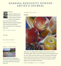
Kathleen emailed me to ask about the color bars in my last post. I have added a new label to my Art Journal blog so you can search by "Kodak Color Bar." A post from April 28, 2018 will come up with further explanation.

When I photograph a painting, I place the color bar next to the work and shoot both together.

Back at my computer, when I bring up the image on my screen, if the color bar on my screen looks the same color(s) as the one I hold in my hand. I know the color is correct. No adjustment needed. 

If the color bar on the screen is too dark, I lighten the photo that has the too dark color bar in it. Too blue, adjust the saturation, color, etc.. I adjust it until the color bar on the screen matches the color bar in my hand then I crop the photo to the artwork (crop OUT the color bar). Voila!

Saturday, April 28, 2018

Color Bar and Words of Love

Words of Love, oil, 24 x 24 inches
©2018 Barbara Benedetti Newton
If you follow me on FB or Instagram you have seen my weeks-long adventure painting S L O W L Y as I posted the painting in progress. Today I am done (simply because I cannot stand to paint on it another minute). After completing a painting, the first thing I do is take a photo of it with a Kodak Color Control Patch included in the photo. This helps me correct the color on my iMac display.


I tape the color bar to the side of the painting so it shows in the photo, take the painting outside to a shaded area and take a photo with my iPhone. Back indoors, I bring the image up on my iMac and enlarge it to the point that the color bar looks the same size as the actual one in my hand and I compare the colors. In Photoshop Elements I adjust each color separately as needed. In this case, the yellow on the screen needed more warmth to match the color bar in my hand. The green needed to be darker, the cyan needed more green and darker and the blue needed to be warmer (more purple) and a little lighter. After those adjustments I saved the jpg and noted it as "Color Corrected."

Next, I compared the color corrected version to the original photo. In this case they are very close but I decided to use the color corrected one.
Color corrected photo is on the right.