Friday, March 25, 2011
the right side

Thursday, March 24, 2011
5 years later

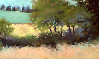
I intended to cut it into two pieces, crop and reframe each as smaller, vertical paintings. But when I unframed it I was immediately drawn to the spontaneous marks in the border area just outside the picture and how they differ from the more controlled strokes within the scene. This led me to reflect how my work today differs from this 2006 painting. Apparently my view of the world has softened and become more tolerant and playful, less literal. My application of the medium has evolved which affects the character of my marks.
So when I cut this painting into two pieces, I couldn't resist reinterpreting the scene on the left. Then, putting the two pieces back together, it was easy to visually compare how I, and my work, have changed. Click on the image to enlarge.
Monday, March 21, 2011
congratulations

Washington state is well represented in this year's Annual Pastel 100 Competition in The Pastel Journal.
Susan Glendenning Third Place Abstract/Non-Objective,
Barbara Noonan Fourth Place Landscape and Interior,
Diana Sanford Silver Medal Award for Excellence,
Karen Schroeder Honorable Mention Abstract/Non-Objective
and me, Honorable Mention Abstract/Non-Objective
for "From the West Unto the East."

Monday, March 14, 2011
Cropping Queen
I love to crop. In our Critique Group I'm known as the Cropping Queen which is probably not what artists really want to call me when I suggest cropping away hours of their work. But, as with reworking, sometimes you have to let go of a precious area or two to get a better statement. One of the challenges of cropping occurs when a painting has a couple nice areas but they are at opposite ends or corners. In that case, you might be able to get two paintings out of one.
I've gone through my inventory and scheduled pieces for upcoming solo and groups shows and find that I need more work! I came across a 2006 painting that I like too much to wash off and rework, but it isn't great the way it is. I'm thinking about cropping it into one stronger statement or maybe into two small paintings.
Below, I've posted some of the cropping possibilities and I'd be pleased to hear comments from anyone who sees a clear best choice. The last image at the bottom is the painting the way it is today.


I've gone through my inventory and scheduled pieces for upcoming solo and groups shows and find that I need more work! I came across a 2006 painting that I like too much to wash off and rework, but it isn't great the way it is. I'm thinking about cropping it into one stronger statement or maybe into two small paintings.
Below, I've posted some of the cropping possibilities and I'd be pleased to hear comments from anyone who sees a clear best choice. The last image at the bottom is the painting the way it is today.


Friday, March 11, 2011

Tuesday, March 8, 2011
Red Square evolution

Sunday, February 27, 2011
simplified red square

Saturday, February 26, 2011
resting red square

Thursday, February 24, 2011
snow light

Finished pastel paintings hang from a beam along the back wall of my studio. It's a good storage place while they are awaiting their frames but it is also usually quite dark. Today we have 3 inches of snow and the whole studio is illuminated by snow light coming through the opposite wall windows. Click on the image to enlarge.
Tuesday, February 22, 2011
red square number one

Thursday, February 17, 2011
another spaghetti sauce side-track?

Today I used the remaining paint in the gallon can to paint over three very bad oil paintings. I had the first panel almost completely covered, just one more brush stroke of red to go in the upper left corner, but I loved the original color peeking through so I left that area unpainted. On the second and third panels, I deliberately left areas without red paint. Now, I'm feeling myself pulled toward abstraction...side-tracked again.
Sunday, February 13, 2011
31 to go?

Another try using the thumbnail sketch I liked so much. I might have to take a break from this winter-marshland series or maybe change the colors to represent another season. The little image below is the oil-wash foundation. This painting is "Hometown Yesterdays," 13 x 13 inches.

Wednesday, February 9, 2011
32 to go

Speaking of memory: artist Loriann Signori has been posting insights about memory painting for many weeks. If you want to go deeply into this subject, visit her blog.
I thought you might like to see the thumbnail I referred to. I may use it again for a painting on a different color ground.

Sunday, February 6, 2011
33 to go

Tuesday, February 1, 2011
34 to go

Monday, January 31, 2011
jump-start

My hometown is Auburn, Washington. I spent my first 21 years there with my family, in a little house built by my father near the railroad tracks. When I was shooting the photos for this series, I could hear train whistles in the distance...music to my ears and soul.
Friday, January 28, 2011
35 thumbnails

I started at the top left corner and closely followed what I saw in the reference photo. My left-brain said "You should write the photo number beneath the thumbnail so you can find the photo again." So, I did that for about 5 thumbnails. Then I got involved in the process of painting and decided that identifying the specific reference photo wasn't important to me.
I found myself caught up in playing with the color and experimenting with the lovely things that watercolor does - such an alive medium! By the time I got to the bottom row, my thumbnails had evolved into value and composition studies with much less detail than the thumbnails painted at the beginning of this experiment. For additional information, I used Photoshop to turn the thumbnail images into black and white. See the image below.
I plan to paint finished pastel paintings using the sheet of original thumbnails and a print-out of the gray scale images as my references. This was a fun, totally absorbing exercise.

Thursday, January 27, 2011
my bright idea


Sunday, January 23, 2011
hometown marshland

Saturday, January 15, 2011
books need new homes

Wednesday, January 12, 2011
a book for you?

Sunday, January 2, 2011
2010 in review
2011 is here and I'm excited to begin painting again after the holiday break, but I was curious what 2010 looks like in review.
 I began the year with a studio clean up and posted a tour on my art journal blog. Studio Tour
 2010 painting began with experimentation in mixed media and non-objective work.
 It wasn't long before I found some old pastel paintings to hose off so I could use the paper for new paintings.
 "Tuesday's Child" was the result of a pastel rework.
 Then, I found some old oil experiments to repaint.
 Suddenly, it was summer and I was back to pastel.
 A trip to Carmel, California and a series of 5 x 7 abstracted landscapes followed.
 I was honored to have an article, "Infinite Possibilities," about reworking pastel paintings, published in the October 2010 issue of The Pastel Journal.
 In the fall of 2010, I began experimenting with mixing my own pastel grounds.
 2010 ended with a series of seven pastel paintings on my hand-made surfaces.
Looking back, 2010 was a year of experimentation. While The Pastel Journal article was certainly a highlight - as were awards received, the primary achievement of the year was learning more about myself through my work and through contact with other artists and those who appreciate art. Thank you for visiting my journal and for your comments and support. Wishing you a happy new year!


Looking back, 2010 was a year of experimentation. While The Pastel Journal article was certainly a highlight - as were awards received, the primary achievement of the year was learning more about myself through my work and through contact with other artists and those who appreciate art. Thank you for visiting my journal and for your comments and support. Wishing you a happy new year!
Wednesday, December 22, 2010

Tuesday, December 14, 2010
december rain

Thursday, December 9, 2010
come dance with me

Tuesday, December 7, 2010
pastel on gesso

Sunday, December 5, 2010
back to bare bones

The good news is my "hand-made" surface held up through three total wipe offs of this painting. I wasn't sure if this surface (my pastel mix on rag mat) could take a hosing as Wallis can so I sprayed it a couple times with Spectra Fix to get some tooth back. After a couple more hours of work on this painting, I took a stiff bristled brush and brushed the whole thing off AGAIN from top to bottom. LOVE the trees in the background, I didn't touch them again after the wipe off. A little work on the purple bush and grasses on the right as well as some distant turquoise. I think it is now as good as it is going to get.
Saturday, December 4, 2010
the point of no return?

Wednesday, December 1, 2010
a good photo problem

Tuesday, November 30, 2010
the ground or me?

Monday, November 29, 2010
tender season

On another note, my long-ago instructor, William Cumming, passed away last week at age 93. I am honored to have a painting he gave me when I was his student. I found this interesting quote from him: "We are not creators -- we are created. I hold the brush, but what holds me? These are troubling thoughts for me as a practicing atheist."
Subscribe to:
Posts (Atom)