Wednesday, February 18, 2015

Monday, February 16, 2015

study #5

Study 5 for Dappled Path, pastel, 6x4 inches
It's a sunny day today! Guess it shows in today's study. I didn't even turn on the overhead Otts lamp attached to my easel. Love this bright morning studio...my new studio will not get the morning sun. Another study on Ersta 500.

Saturday, February 14, 2015

path study number 4

Dappled Path 4, pastel, 6x4 inches. Study for a larger painting.
I'm continuing to work on the small studies for a larger painting. A different paper this time - Ersta 500. It is like working on fine suede and takes some getting used to. The soft color application that results from very little paper tooth encourages me to do more line work for definition. Hmmmm...

Friday, February 13, 2015

another study

Dappled Path 3, pastel, 6x4 inches, color study for a larger work
Another version of Dappled Path. - repainting this scene may become my Life's Work.

challenge progress


Dappled Path, pastel, 23 x 18 inches, 2005
In my last post I mentioned a new challenge I invented for myself: to paint  a color study based on an old painting but with a new interpretation of strokes.

It didn't work as planned but I am very happy with the new painting, shown at the end of this post. I used the original Dappled Path, painted 10 years ago, as my reference. Many of the same colors were used but in different amounts. The paper makes a big difference - the original was painted on Canson Mi-Teintes and then, I used the texture to tell the story. This time I used Colourfix. I really did TRY to stay with the original composition but the creative process took over. See the progression below.
Step One - charcoal sketch
Step Two - dark pastel
Step Three - and from here it took on a life of its own.


Dappled Path II, pastel, 6 x 4 inches, 2015
My next challenge is to paint Dappled Path II 23 x  18 inches, unframe the original and use the frame, mat and glass for the new painting. 

Wednesday, February 11, 2015

Packing and a new challenge

Packing up for the move. 
The pastels that have been beside my easel have been in two large Dakota pastel boxes. They are mostly Schmincke, Unison and Sennelier.  Also, a half dozen boxes of Terry Ludwig and two chests full of NuPastels (a generous gift years ago from Cathy Woo). For the move I'm using the little foam cradles that came with my boxes. If you click on the photo above, you'll see them at the far end.

When I married Jay 27 years ago he built a detached garage so I could have the attached garage for my Studio. Jay and my father made a wonderful studio for me including a ton of under-counter storage. I have been packing up art supplies and my storage areas are full again.

My new project
My studio has been rearranged (again) in a way that gives me a wall to hang the larger work that won't fit in the storage area under my counter. The large painting on the left in the photo above is still pleasing to me overall and in fact, has some very nice areas but some not so nice too. As I became more skillful in working with pastel, my strokes matured and I am imagining this scene as I would paint it today. In preparation for doing that, I'm going to start with a small color study of the painting. Then, from the small study, I'll paint the scene again in large format. Actually, I can think of  quite a few old paintings I'd like to try this with. I'll let you know how it works!


Tuesday, February 3, 2015

done thinking

Godspeed, pastel, 16.5 x 23.5 inches
I am so excited to move to my new studio that will have new track lighting. Paintings are one color on the easel, another color under overall studio lights then another color as I move to the window. I'm done thinking about it. I put it in a frame to keep it safe (from me). Click on image to enlarge for detail.

Friday, January 30, 2015

revisiting LaCarte

In July of 2013 I painted a pastel on LaCarte paper - a coarser surface than my favorite Wallis. At that time, I wanted a soft look for the painting shown above so it was a bit of a struggle. Today I pulled the painting out and began lifting color off with a hog bristle brush.

Here you can see the color of the paper showing through. As I lifted, removed and added more color, my mind was occupied with good thoughts of my former father-in-law who passed away today. I was painting on auto-pilot. At some point, I realized I was loving this paper!

"Godspeed" is sitting on my easel...I'm thinking about it. And, I wonder if I have anymore LaCarte. For those of you who are not familiar with this paper, you CANNOT get it wet and since I usually work with an underpainting, I have avoided it. Hope I have another sheet in my flat file.

Wednesday, January 28, 2015

acrylic underpainting for pastel

A few days ago I painted an acrylic under painting on Wallis paper. Finally got back to it today.

Path to Gold Creek, pastel, 13 x 17.25 inches

Friday, January 23, 2015

glory days II

For my sanity, I had to end the week with a pastel. Glory Days II, pastel, 13x17 inches.

Thursday, January 22, 2015

second trio and goodbye pretty

If you read my posts of January 13 and 15, you saw my pretty reference photo. I've worked with that photo before as a lesson on value but can't remember completing a painting to send out into the world. Now, here I am again, using the same reference photo for the second trio of acrylic paintings. And, once again, I'm losing interest in this pretty scene. Give me wild, unkempt, tangled nature and I'm inspired to paint. The above painting - about 70% complete - is as far as I got before I started gagging on pretty. The other two panels have been painted over, scrubbed, poked and prodded and I'm starting to get somewhere (somewhere I want to go) with them.

Love the top half of this. Just before leaving the studio last night, I took a wet paper towel and scrubbed off the lower half. I'll start on that again today.

This one will probably be a loose interpretation of the pretty reference photo. Back and forth, paint on, paint off. Running from "pretty."


Monday, January 19, 2015

acrylics to Cole Gallery


Tomorrow I will deliver the first three acrylics of 2015 to Cole Gallery for their annual Anniversary Show. The Opening Party is 6:30 - 9:00 PM, February 7th.

Friday, January 16, 2015

Second Trio Step Two

Here they are again, this time with the darkest value added. I noticed when working with interactive acrylics that sometimes in my enthusiasm, I accidentally lifted off too much value so today I applied varying amounts of acrylic Lamp Black, NOT interactive. And, to keep it loose, I used a rubber spatula instead of a brush.


Thursday, January 15, 2015

a little preparation

Continuing from yesterday...
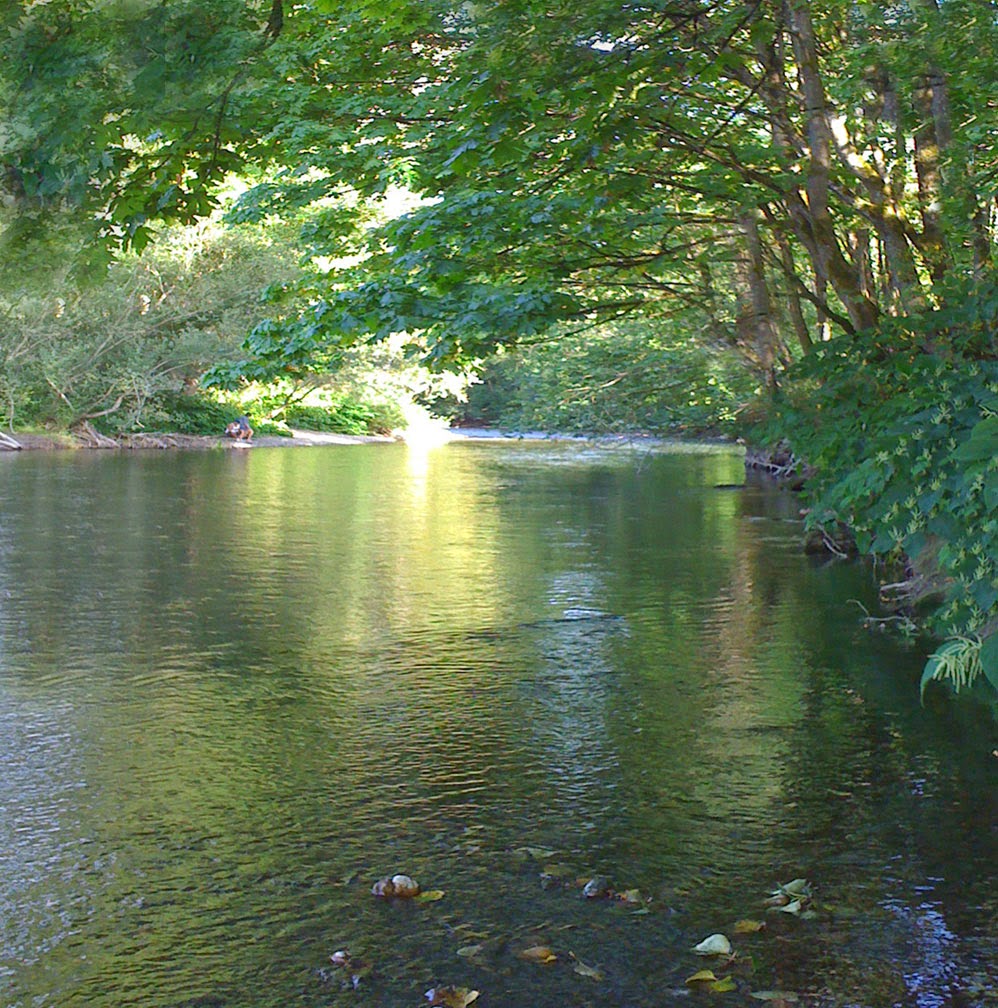
As I started to work on the three little acrylic foundations I posted yesterday it occurred to me that it would be easier to reformat the reference photo from the vertical format to a square. Then, once I started playing with the photo - which, by the way, I am amazed I could actually find in my computer - I couldn't help looking at the composition and values so I used PhotoShop to change the focus of the light to keep it more in the middle. Below is the adjusted reference photo that I will be working from.
Tuesday, January 13, 2015

next three acrylics


The next three acrylic experiments are on the easel. Color is arbitrary - brushfulls of paint applied to white Ampersand Gessobord while I was cleaning my acrylic palette. I lifted color off using a paper towel and/or brushes. Also, I misted the first one with water and let it run. These three are starting out as the same scene using a reference photo from September 2011- see my sketchbook entry below. The original painting from this photo shoot of the Cedar River was used as an Art Journal Blog post called The value of value.
 

Thursday, January 8, 2015

sunrise on our pond

Faithful, acrylic, 6 x 6 inches
I have been meaning to paint scenes from where we live now but I keep getting side-tracked. Fnally, this one is the sunrise over our backyard pond. I have included the reference photo so you can better see my interpretation. I am enjoying the give and take of the interactive acrylics and the ability to lift color. For more information on this medium, see the December 2014 issue of The Artist's Magazine for an article by my friend, Cathy Woo. This is the third acrylic painting of my Leap to Faith trio.


Tuesday, January 6, 2015

painting with faith

With Faith, acrylic, 6 x 6 inches
I am holding on to faith that I will be able to pull off another acrylic painting. I'm working with only one, 1" brush on these little 6x6 inch Ampersand Gessobord panels. When I move to larger work I will have more space to finesse my angular strokes. Right now, I'm enjoying glazing for color and dragging a tacky brush over the surface for texture. Once again, I have done composition check by turning the painting. None of the views annoy me so I'm done.


Saturday, January 3, 2015

Turn, turn, turn


As I was framing "Leap to Faith," I enjoyed the yin/yang of the piece as I rotated it. The balance of light and dark is pleasing to me each way.

Friday, January 2, 2015

Leaping

Leap to Faith, acrylic, 6 x 6 inches
Well, I have to say I am pretty excited about acrylics! If you have been following this blog, you know that this little painting began as a Notan done with regular black acrylic paint (not open or interactive) on a white Ampersand Gessobord panel. It has been hanging around my studio for about a year.

I began work on it a few days ago using Atelier INTERACTIVE acrylics on top of the black and white foundation. What fun! I have been able to glaze, wipe off, start again, poke, prod, lift and rub with a cloth to create a little painting of simple shapes and masses and subtle color. I don't know why I have avoided acrylic paint for so long. Well, yes I do know...it was because I want soft edges and I didn't know it was possible to get them with acrylics. The color on this little painting was built in many layers creating nuances of hues and luminosity. I don't think the photo does it justice.

I have been packing up my studio for our spring move and I'm surprised how many acrylic paints I have. After I work with the interactive type for a while and gain more faith in my ability with this new medium, I plan to move on to the regular acrylics simply because I have them. I am leaping TO faith - not scary because I'm painting just for myself without the pressure of shows or gallery commitments.

simplification

I'm going to be working toward simplification in 2015. Simplification in my finished work (simplified shapes and values) as well as in the way I work. In the Spring, my studio and office will be separated. No more tempting dings from the computer when a new email comes in. Yes, I know I could just turn down the volume but it wouldn't work. I would become curious, stop painting and go to the computer and look.

Acrylic seems like a simple medium so I'm trying it. No solvents, easy clean up. Shown above are the three little paintings and my first hour of exploration with acrylic paint. So far, so good. In fact, some nice surprises and glazing and lifting color back off (a favorite technique of mine in all mediums). I don't know where these three little paintings will end up but today, I am hopeful.


Thursday, January 1, 2015

Notan


I found three old 6x6 inch Ampersand Gessbord panels with black acrylic Notan paintings in my studio. The middle one looks like the whole panel was painted black then white acrylic created the Notan. These are perfect little foundations for me to begin playing with the Atelier Interactive acrylics I want to try. Stay tuned.

Nōtan is a Japanese design concept involving the play and placement of light and dark as they are placed next to the other in art and imagery.


Saturday, December 27, 2014

Happy New Year!

Another scene from our home in Renton, Washington. This is the bamboo along the street as it catches the light of the setting sun.

Link: Looking back and looking forward

Sunday, December 14, 2014

a few things

A few things:

Bursting into flame: 
This morning I received a comment on one of my posts. Here is an excerpt: "In everyone’s life, at some time, our inner fire goes out. It is then burst into flame by an encounter with another human being. We should all be thankful for those people who rekindle the inner spirit." 

How true! I have a file folder on my computer desktop titled "Ready to Paint, Look Here." When I come across an image that impresses me, I label it and put it in this folder. Then, when I am ready to paint, I look at the images for inspiration.

The reason I'm not painting:
The image above, taken yesterday, is our house-in-progress. It is the reason there isn't a lot of new artwork posted on this blog. Our completion date is spring 2015 but then there will be landscaping. Every few weeks I have an art spurt - the last one was five paintings in 10 days but now I am back to selecting the house gutter color, deck floor color, etc. If you would like to follow progress on the house (and new studio), here is the link to our house project.

By the way, it just LOOKS big from the water. The building behind the house is my husband's garage. My new studio will actually be smaller than my current studio but I plan to have my office in another room. In my current studio my office area takes up a quarter of the space. It should be interesting...while I am painting there won't be the distraction/temptation of incoming emails and there will be more space for the possibility of teaching in the studio.

Mentoring and Workshops:
In January 2015 I will begin to mentor a Canadian artist. It will be a three month one-on-one online test. If it turns out to be a good fit for my new life, I hope to do more of this beginning in Fall 2015. If you are interested in being put on a list for online mentoring or a workshop with me, let me know. Contact


Tuesday, December 9, 2014

a little gift

Autumn at Anahim Lake, pastel, 5 x 7 inches
"Autumn at Anahim Lake" is back in the Studio after its debut in the Northwest Pastel Society 2014 Small Works Show in Oregon. A little holiday gift for yourself or a friend? Happy Holidays!

Friday, December 5, 2014

annual tradition

"Tradition," pastel, 7 x 11 inches
It is my annual tradition to rework older paintings that I'm no longer happy with.  Today, it was "Road Show: November," a painting that has hung in one of our bathrooms for years. I have enjoyed it there but when I rotated art recently and hung something new in the bathroom, "Road Show: November" ended up in my studio and my painting style of five years ago began to bother me.

Brushing off Road Show: November from 2009
I unframed the painting, brushed the pastel off down to the ghost image. To bring the sky up in value, I applied an under-painting of white acrylic with a rubber spatula for a mottled effect. Once the acrylic was dry (just minutes) I began to work over all in pastel. This painting went through some very bad renditions and took way too long before "Tradition" emerged. It is named that for my annual tradition of reworking paintings - and because no other title besides Aaargggh! came to mind.

Thursday, December 4, 2014

saving grace

Doing that year-end thing again...reworking paintings that really need help. I gave this painting a partial rework - softening some detail, adding a darker value in the lower left to open up the entrance to the painting, extended the light grasses in the upper right corner to open up the view there but added some shadow to bring the eye back to the center and the road. Wiped off the orchard and added just enough color and detail to indicate trees...I am careful to keep them as an illusion, not a botanical rendering of trees. I'm happy to have saved what grace the original painting had and to have updated it with the signature of my recent work.

Monday, December 1, 2014

autumn memories from memory

Autumn Memories, pastel, 10 x14 inches
Late yesterday I unframed an old abstract pastel and began again with an oil wash over the top of the pastel ghost. It's fun to wake up to a painting foundation that has dried overnight and is ready for the pastel. This one went through some pretty bad stages until I put the iPad reference photo away and began to paint from memory. No specific place in mind...just what I know about marshy, brushy scenes. I like it. See the reference photo and the oil foundation below.