Friday, October 29, 2010

stuck and unstuck

If you have been following this journal for the past few days, you know that I prepared two acrylic paintings to accept pastel. I finished the first one and posted it a couple days ago. I am stuck on the second painting. I could move forward adding more color, value, lines with pastel but I might get to the point of wanting to wash it off and I'm not sure this particular ground could withstand that process.

Here's how I'm going to get unstuck. I took a photo of the work and printed it out. Now I'm going to add colored pencil to the printout to see what might work when I go back to the easel with pastel. I've used this method before and it worked well. Let me know if you try it and how it works for you.

Wednesday, October 27, 2010

born to the season

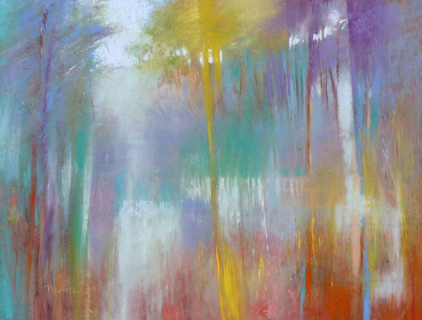
Here is my experiment of turning an acrylic painting into a pastel painting. The scene was inspired by the precious end-of-fall days we have had recently. This painting is best viewed REALLY CLOSE to see the part the texture plays. Click the image to enlarge.

enjoy the process


Enjoy the process. I did! Recap: I had an old acrylic painting on a piece of 18 x 18 inch masonite. It was very textured because when I gessoed the masonite, I added a sheet of tissue paper and scrunched it around with my fingers to make a few ridges.  To prepare the surface to accept pastel for a new painting, I spread Golden Acrylic Ground for Pastels over the old painting with a palette knife, intentionally making additional texture with my strokes. When it was dry, I used PanPastel for the first layer of color(s). After that, I applied pastel sticks as usual (the end, the side, poking, dragging). I love the way the ridges and high areas grab the color and valleys don't get any unless I go back into them with more pastel.

Tuesday, October 26, 2010

PanPastel opportunity

When the Golden Acrylic Ground for Pastels was dry, I began applying pastel but quickly found that the very textured surface (intentional) really ate up the pastel stick. Aha! A good opportunity to do much of the work with PanPastel applied with a sponge.

Monday, October 25, 2010

acrylic to pastel

You may have read my October 2010 article in The Pastel Journal magazine about reworking pastel paintings. Or, if you've been following this blog (thank you!) you have seen revisions of pastel paintings. I ran out of pastel paintings to rework so I'm going to try to turn old (and very bad) acrylic paintings into pastel paintings.  Today I used a palette knife to spread Acrylic Ground for Pastels over two lumpy, bumpy old acrylic paintings. I'm not concerned with getting a smooth surface, I like a lot of texture and I can see the ghost of the old painting through the gritty new surface - that's exciting.

Monday, October 18, 2010

step art

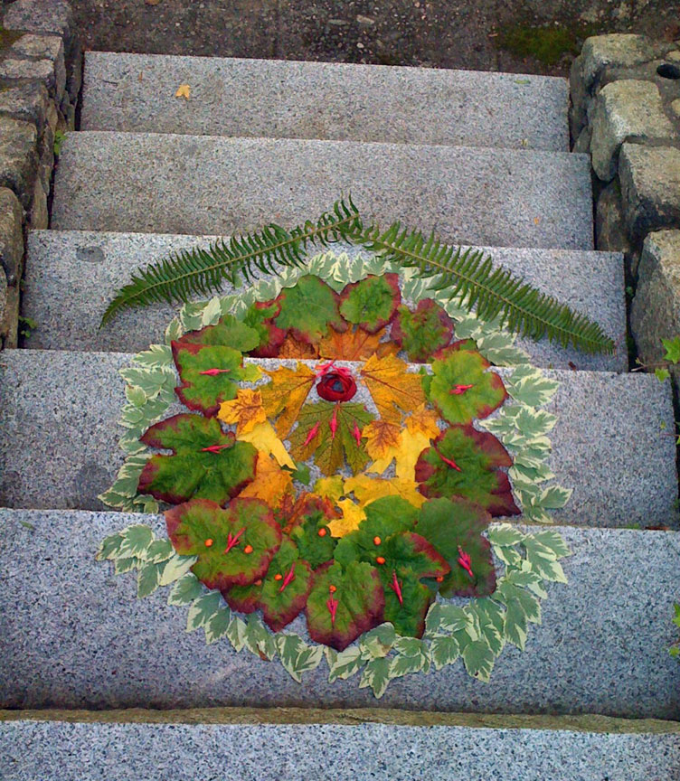
My very clever and artistic grandsons (ages 9 and 11) made this beautiful garden collage on the steps leading out of their mother's flower garden. Click to enlarge.

Monday, October 11, 2010

a roadside attraction

I have taken about a million photos of scenery we hurry past when my husband and I are on road trips.  I'm always excited to view them later to select references for paintings but my photos are always disappointing.  Telephone poles, bridge railings, the side mirror of the car, and sometimes I have no idea what I was thinking when I pressed the shutter button. But on our way home from Leavenworth, we came upon a road crew so we were completely stopped for several minutes. And there, right beside our car was a beautiful little scene: two trees, brilliant with sunlight and steeped in shadow - bright fall foliage and tall dry grasses at their base. Click!

I thought you might be interested to see the oil wash foundation for this little 9 x 8 inch painting.

Friday, October 8, 2010

sleeping lady

This painting is from a reference photo taken while on a late afternoon walk at Sleeping Lady Resort in the Cascade mountains, Leavenworth, Washington. I guess I'm in my "dry grass" phase now. Click on the image to enlarge.

Sunday, September 26, 2010

dust

The excess pastel dust (all colors mixed together) from my paintings falls into an aluminum-foil gutter attached to my easel. When I cleaned my easel this week, I poured the dust from the gutter onto a glass palette that is usually used for mixing oil paint, added water and mixed it well with a palette knife to the consistency of stiff peanut butter. Next, I sprayed a clean area of the glass with water and laid down a piece of plastic wrap (the water keeps the wrap from moving around). I scooped up the pastel-blob with the palette knife and plopped it onto the wrap. I picked up two opposing edges of the wrap and rolled the blob side-to-side forming a little log.  I left it on the plastic wrap to dry.

A few days later, when it was thoroughly dry, I compared the muted gray/green color to the color of pastels I already had. Schmincke 093 H is darker and a Rembrandt color is lighter and has more yellow in it. I love my homemade color and plan to use it in my next painting.

Thursday, September 23, 2010

waiting frames

I thought someone might be interested to see how I store pastel paintings that are waiting to be framed.

Paintings that are complete are attached at the top edge onto archival foam core, matted (with foam core spacer painted black along the window-edge) and glass is laid over the mat. Bubble wrap corners hold the whole thing together while the painting is waiting for the frame. Additional paintings that I either haven't gotten around to sandwiching, or am not sure I'm done painting on, hang from pants-hangers along a closet rod in the corner of my studio.

I have nine paintings here waiting for frames. The last time I framed a group of paintings was May of this year so I guess I frame about twice a year except for emergencies.

An example of an emergency is having a painting accepted into a show and then finding out that, with a mat around it, it exceeds the maximum size limit (a reminder to read the prospectus carefully). I had to reframe the painting without a mat which I would like to continue doing, but I can't seem to get used to the look of my work without a mat around it.

Sunday, September 19, 2010

added color

It poured down rain all day today as I painted in my studio. Maybe that's why this scene is more colorful than the subdued hues I talked about in my last post - the one with the reference photo.  Overall, I think it is improved but it isn't as loose as the plein air version and loose is good. If you want to see the workshop version, scroll down to August 3.

Saturday, September 18, 2010

starting again, again

The second day of the Handell workshop started with an overcast morning. Loaded with plein air gear, I wandered around looking for my morning painting spot. Just off the road I found dry, sleepy grasses in beautiful subdued colors. A few hours later, in full sun, the grasses became boldly upright and crisp with lots of hard edges. I liked my painting from that morning but, once again, I consider it workshop work so today I hosed it down to the ghost image to begin again.

Wednesday, September 15, 2010

being there

As in the reference photo, the sky is blue, there is a tree on the left, Queen Anne's lace in the foreground and a wheat field in the distance.

When I painted this scene plein air, I interpreted literally but in the studio with only the reference photo to remind me, I found myself remembering the total experience of being there, not just the scene before me. The hot blue sky, the dry meadow foliage around me and crunching under my feet, the expansive beauty of this place (painter Amanda Houston's home). I like the fairly realistic tree as a place for the viewer to enter the painting but from there, the path is to the right into abstracted distant trees and then back to flower heads in the meadow. For now, "Wheat Field and Meadow" is safe from the garden hose.

Tuesday, September 14, 2010

starting again

Today I hosed off my painting from the first day of the Handell workshop last month. The charcoal lines and a little pastel color is the "ghost" that remains. Also, here is the reference photo (see the edge of my easel far right?). I'm going to try the scene again. Realistic or abstracted landscape? Not sure yet. I washed the work away rather than finishing the painting because it occurred to me that I would always have to keep this painting separate in my inventory as a piece that was done under workshop guidance and therefore not eligible for competitions.

Monday, September 13, 2010

tidal marsh revisted

Last month I rotated art at Attic Gallery in Portland, Oregon and brought back a painting that was based upon a reference photo my husband took of a tidal marsh. I decided to rework it and when I unframed it, I found several inches of unpainted Wallis paper at the top and bottom. A painting that used to be 10.5 x 18 has become an abstracted landscape inspired by the first painting but larger. The image now measures 15 x 19 inches.

Wednesday, September 8, 2010

infinite possibilities

There I am on pages 42-47 of the October 2010 issue of The Pastel Journal - Yay! Opening pages show an original painting and how it looked reworked once and then again when it finally became "Summer Song in Blue" (shown recently in the Great Lakes Pastel Society Show.)

Sunday, September 5, 2010

resolution

Here is the finished painting that I have been posting in progression for several days. I enjoyed taking this from a very conservative landscape (washed it off, turned it upside down and began again) to a colorful abstracted work. The steps I have posted will give you an idea of my preferred way of working - perhaps it is unusual but it keeps me interested. "Time after Time" 11 x 15 inches.

Saturday, September 4, 2010

thinking

An afternoon of painting changed this scene quite a bit. It would be easy to stop now because I am satisfied with the overall mood, color transitions and relationships that make this foundation. But, as with a good story, it is missing the "hook" that will catch the viewer's interest and hold it long enough for further exploration of the image. To help me decide what to do next, I will look at this image in grayscale on my computer. It needs some push and pull, some conflict. I have to think...this is the hard part.

Friday, September 3, 2010

playing

For about an hour I just played around. The areas I lifted off are gone, they served only to get me started. I applied pastel, brushed some of it off, put a different color or value in the same place - or someplace else. This is the fun part because it is a big mess with nothing but potential - but already I have some favorite areas that I want to save. As those areas become more precious to me, I'll try to make the rest of the painting work with them...and if they are holding the painting back, I'll have to get rid of them. For now I will turn it to the wall so I'm not tempted to do anything to it until I can set aside a few hours to bring this painting closer to resolution.

Thursday, September 2, 2010

looking for clues

I begin to look for clues - a color, shape or texture might suggest what I could do next. With a stiff brush dipped in water in one hand and a paper towel in the other hand, I begin to lift the red watercolor off the paper in selected small places within the focal area. Lift, blot, lift, blot. I also lift color to play with the shape on the left that suggests a tree. Next, with a beautiful blue (B120) Terry Ludwig pastel I add an area that might be a sky and an area that might be water. I know the name of the color only because I just got his small box of ultramarine blues and they are still in order. What I've done may stay, go, or change in some way...I don't know yet.

Tuesday, August 31, 2010

trusting the process

"Eliminating things from a composition is the best way to get to the essential statement. We become attached to whatever appears in our creations." "Rubbing out and painting over are essential techniques for every artist." Excerpts from the book Trust the Process by Shaun McNiff.

I unframed an old pastel landscape painting, washed most of the pastel off, turned the painting upside down and while it was still wet, brushed red watercolor around. There. I eliminated that composition. I'm excited to see what happens next.

Monday, August 30, 2010

reading and reviewing

I'm reading Trust the Process: An Artist's Guide to Letting Go by Shaun McNiff. So many of Mr. McNiff's words ring true with me that I sent him an email asking permission to quote from the book and he agreed. So, you'll be hearing bits and pieces of it on this blog as I work my way through. "Emanation is a process of one thing emerging from another, and this quality of creation reinforces the importance of working in a series." Last spring I painted a series of four 5 x 7 scenes of sand dunes. Then, a series of four landscapes, then recently, four more. Here they are, all together. Click on the image to enlarge.

Sunday, August 22, 2010

my experiment


I've been doing a lot of thinking about process vs product. If I give myself as much information as possible in the planning stages of a painting (careful sketch on my painting surface, careful underpainting to guide me) there is a better chance that I'll have a successful painting/product. However, I don't enjoy that process as much as doing an interesting oil wash with color and texture that merely suggests my scene. So, I thought I'd try my previous painting again. Above is my loose oil wash - that was fun.

For Summer Sojourn 2, I looked at the reference photo but didn't look at the first painting (posted August 16th). My lighter application of pastel left more of the foundation showing to become part of the painting. My favorite area is the upper right corner (click to enlarge). All in all, I ended up with a similar painting, but without careful planning, this time I had to work harder and talk to myself more about what and why. It was a more challenging and engaging process for me. I find this interpretation to be more lively and I believe I have given the viewer more to think about.

Monday, August 16, 2010

dancing marks


 With Mr. Handell's words whispering around my brain, I began my first painting since the workshop. I want to be careful like he is. And, my graphite sketch was. I was precise with the form of the trees and bushes; I indicated in graphite where my darkest values would be. Next, I put the painting on my easel and began a line drawing in a dark green oil paint wash. The first few strokes were careful. Then, I just went crazy turning my careful lines into dancing marks. Happy, I went to bed. Every time I awoke in the night (it is too hot to sleep), I remembered my marks and was excited to get back to the painting...and that is how it should be!

I wanted my first painting after the workshop to reflect Mr. Handell's wisdom and recommendations. "When you aren't sure what to do, do nothing. Walk away. Turn the painting to the wall for a while if you have to. Be more patient." I really did try to follow his advice.  I don't know if this painting looks any different from those of my pre-Handell days but I do know that with more careful planning, it wasn't ever in danger of being washed off and I am pleased with the result.

Sunday, August 15, 2010

new friends and third place award

One of the nicest things about the internet is contact with other artists. Recently, Jim and Lynne Babcock emailed me in support of my work. Turns out they live not far from Auburn, CA, the location of the current Pastel Society of the West Coast Member Show.  They were very kind to take time to visit the show and send me this photo of Jim with my painting "Foreseeable Future." They also let me know that it received a Third Place Award in the Associates category! Jim is an accomplished painter; take a look at his website.

Wednesday, August 11, 2010

overcast and windy

I'm letting the Albert Handell workshop sink in by scrubbing floors, cleaning the studio and gardening. When the time is right, I'll start painting again but I just found this little plein air piece that was done the day before I left for the workshop in Oregon. I was in a pasture in Cle Elum, WA, at the end of an airfield landing strip. It was overcast and very windy - so much wind that I finally gave up trying to paint and watched people fly kites instead. Of course, this painting contains my favorite yellowy-green which has now been identified as Terry Ludwig G360. Love it!

Saturday, August 7, 2010

look in the lower left corner

Just got home from Oregon. While going through the mail I was surprised to find my work included on the show card for The Pastel Society of the West Coast Membership show, August 12 - October 2, 2010 in Auburn, CA. That's me...the tiny image in the lower left corner (click to enlarge). This painting, "Foreseeable Future" is also my Facebook profile image. My other painting in the show is "River Walk" and is shown in the sidebar of this blog.

Friday, August 6, 2010

Day 5 with Mr. Handell

Mr. Handell's tree painting demo this morning began later than originally scheduled because we were all at the workshop until nearly 11 PM last night having one-on-one critiques with him followed by a stunning 60-slide presentation of his work.
This morning, his drawing of this tree was s-l-o-w (and careful) which gave me time to ponder my critique feedback from last night and, in doing that while watching him draw, I had an epiphany about myself and my work. In short, I'm tired of making "pretty pictures." (This may be one of the reasons I have been experimenting with abstracting - and that's a good thing.)  Ever since I broke away from the precise colored pencil of my past, I took joy in making imprecise marks and fully expect all marks I make with pastel to WORK. Many times they do and I complete another pretty picture. When they don't, I hose it off and start again. I now realize that if I am to make art that is MORE than a pretty picture, I need to spend much more time in the foundation/bones stage. S-L-O-W DOWN. Well, that's the short version of my breakthrough. My thanks to Mr. Handell for the part he played in my revelation.

After the demo and lunch, students caravanned to a new location: old farmhouse and out buildings, meadows wild with Queen Anne's lace and weathered fruit and filbert trees. Reminded me very much of the farm on Vashon Island where I raised my children. With every step around the acreage there was another emotion-filled scene for me and I took 103 reference photos for future paintings. Other students were setting up to paint for a couple hours, but I was spent. That's when I came upon this rose. "You look like I feel," I said to the rose. Talking to roses; time to quit.
As I write this, I am in my motel room for the evening. Tomorrow, after delivering art to Attic Gallery in Portland, I'll head back to my studio and what is forecast to be a rainy weekend. Sounds great!

If you would like to read more about this Albert Handell workshop, visit the blog of my new acquaintance and fellow artist, Brenda Boylan. She has many photos and notes from the workshop to share as well as beautiful work. Also, thanks to Susan, Amanda, Jan and all the friendly and supportive artists I met this week.

Day 4 with Mr. Handell

This morning Mr. Handell demonstrated oil painting. What exciting work! After lunch we all took off to various spots for an afternoon of independent painting. I went back to the walnut grove, this time to paint the scene along the edge of the grove.

 Jan Wall and Amanda Houston painting in the walnut grove.

 Jan trying the garden hose method on a painting that was bugging her.

Wednesday, August 4, 2010

Day 3 with Mr. Handell

The morning of Day 3 was a watercolor-foundation pastel painting demo by Mr. Handell. Spectacular! In the afternoon we painted in a huge walnut grove. My painting is mostly just watercolor foundation. After waiting for the Wallis paper to dry, I applied pastel to the trunk and main branches. His advice was to keep on going and I do have reference photos but this painting may not ever be resolved. It might end up being the foundation for something new. Students here are amazing, many finished their paintings on site.

Tuesday, August 3, 2010

Day 2 with Mr. Handell

Day two with Mr. Handell, shown here with my two plein air paintings at the end-of-day critique. See each painting and his suggestions below. Students are having a great time and everyone is improving under his guidance and through watching him paint today. He is very careful and thoughtful in his work.

This is my 8 - 11:00 AM painting of wild grasses. Skies were overcast so no cast shadows. A lovely gentle area in the morning. Later, in the strong afternoon sun the grasses appeared harsh and brittle. Mr. Handell suggested added value in the right foreground to keep the area from floating away. Click on image to enlarge and look closely to see his marks made with charcoal.


Afternoon painting from 2 - 4 PM is meadow/pasture land with wheat fields in the background. The vast stubble areas of recently harvested wheat are overwhelming in the hot afternoon sun. Simplification was my goal...so much so that Mr. Handell suggested more grass detail work in the foreground. When I get back to the studio next week I'll work on these paintings and post them when they have been resolved.

Monday, August 2, 2010

painting with Mr. Handell

I'm in Oregon at an Albert Handell workshop. Hot. Fun. Exhausting. This is today's first plein air effort. Mr. Handell suggested touches of Unison G-10 to enliven the tree at the left. The color in this shot isn't correct. I should have brought my Kodak color bar/gray scale with me! I'll post it again after I get home. Having a good time with 20 other students, all doing good work. Back at it tomorrow at 8 AM.

Thursday, July 29, 2010

july in alaska

This scene from my husband's recent fishing trip to Alaska may be the last painting with my favorite yellowy-green pastel. I am down to a couple little pieces and I'm not sure if it is Unison or Ludwig. Very close to Terry Ludwig D1 but seems a little lighter. I may have to post for help if I can't figure it out.

Monday, July 26, 2010

wild wood

When I painted plein air recently at Kubota Garden, I applied a loose watercolor foundation on a 14.5 inch square of Wallis then worked in pastel on top of the watercolor when it was dry. After a week on the easel in my studio, I couldn't think of anything it needed and decided it was best left in it's lively, wild state. For me, a plein air painting becomes less alive if I begin work on it again in my studio, away from the scene of inspiration.

Saturday, July 24, 2010

day time

Another little plein air painting from a couple weeks ago. 5 x 7 on Ampersand panel.

Thursday, July 22, 2010

time for a change

This little painting was completed a couple weeks ago. A deliberate change of palette.

Saturday, July 17, 2010

wild side

Today I joined members of the Colored Pencil Society of America, Washington Chapter, to paint plein air at Kubota Garden in Seattle. Most of the 20 acre garden is manicured and tidy. I managed to find a wild area with tall grass going to seed for this little 5 x 7 inch pastel.

Tuesday, July 13, 2010

suddenly summer

When I began working in pastel years ago, I used Canson Mi-Teintes paper instead of the sanded surfaces I use now. This week, out of curiosity, I tried Canson again. I found I couldn't get the subtleties of layered color that happens with sanded paper. Because of this, I didn't enjoy the painting process as much but in the end, Canson gave me a bold, saturated application of color that looks more like paint. This is our front yard, looking West.

Monday, July 12, 2010

view east

Here's the painting in the easel photo on that hot, sunny day of plein air painting. Last night it rained and was gray and cloudy today. This 5 x 8 inch painting is on a little scrap of Ersta I came across while cleaning the studio.  The scene is looking East from the back deck.

Sunday, July 11, 2010

back to it

After a three week break from painting, I set up my easel on the deck in 90+ degree weather (note the glass of ice water). It was fun to paint plein air again -  especially with food, water and the bathroom just steps away. I hope to be back out painting again tomorrow, moving around our acre for new interpretations of well known views.

Saturday, July 10, 2010

more great news!

"Tuesday's Child" received an Honorable Mention Award from judge and president of the International Association of Pastel Societies, Maggie Price. I was honored to be one of only 36 artists selected for this show by jurors Alan Flattmann, Liz Haywood-Sullivan, and Jimmy Wright and now am very HAPPY to have received an award! See the show online HERE.