I just received word that my pastel painting, "Sanctuary," received the First Place Award at the Women Painters of Washington Annual Members' Show at Scott Milo Gallery, Anacortes, WA. The judge was Jennifer Bowman. Yay!
Whoops! Just found out WPW have combined Best of Show/First Place so this is actually Second Place but I am happy! Later...a communication problem. It really is First Place!
Wednesday, May 2, 2012
Friday, April 27, 2012
color study in oil
I've been painting exclusively in pastel since January so it was fun to work in oil again. This is a color study for a larger work. By the time I get ready to do the larger work from this study, I'll probably be back to pastel. This painting is 7.87 x 10 inches on panel. It will be for sale in the auction at Daily Paintworks tomorrow with a starting price of $30.
Oil Study #1 is sold
Monday, April 23, 2012
Friday, April 20, 2012
life on the edge
The working title for this piece was "Rivulet" but it ended up titled "Life on the Edge" for the stream bank and for my sanity in painting it. A difficult subject with so many elements that could be attention focal points. I had to pick and choose what to play up, what to subdue.
This painting may be my last for a while because a huge pile of garden soil was delivered today and I have a new greenhouse, big empty pots for the deck and a vegetable and flower garden waiting.
The color study for this painting is on the Daily Paintworks Auction until April 24th. I always appreciate hearing from followers and subscribers to this blog and thanks to all who comment and "like" my work on my Facebook page.
This painting may be my last for a while because a huge pile of garden soil was delivered today and I have a new greenhouse, big empty pots for the deck and a vegetable and flower garden waiting.
The color study for this painting is on the Daily Paintworks Auction until April 24th. I always appreciate hearing from followers and subscribers to this blog and thanks to all who comment and "like" my work on my Facebook page.
Thursday, April 19, 2012
90% there
This painting has been full of challenges. I want the focus to be on the stream or rivulet but the bank is actually more interesting than the water. I want to include the blue wildflowers but they can't be so detailed that they compete or distract from the bank and the water. Back and forth, back and forth.
To complicate matters, the little study is a vertical scene (5.75 x 4.5 inches) and the finished painting is square because I washed off an old painting to use the surface and frame again. I'm getting there but there are still many decisions to make. You can see the color study using a cool magnifier here.
Tuesday, April 17, 2012
I'm working on the focal point of this painting first, tentatively titled "Rivulet," with the small color study as my guide. As paintings are completed, they are framed and entered into exhibitions or go to one of the galleries that represent me. The small color studies are much more affordable and are available matted to 10 x 8, ready to frame, on Daily Paintworks.
Monday, April 16, 2012
For the first time, I was sad to wash off an old painting because the majority of this painting "worked". It is my eleventh rework of 2012; my quest to rid the studio of mediocre work. Sitting atop the old painting is the little color study for the new painting.
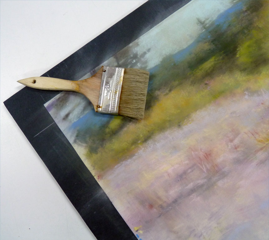
This is the ghost of the original painting on Wallis paper, after the hose-off. The black lines are the charcoal sketch for the new painting.
The oil palette for the new underpainting.
The oil-wash underpainting is complete and is drying overnight, awaiting pastel.
This is the ghost of the original painting on Wallis paper, after the hose-off. The black lines are the charcoal sketch for the new painting.
The oil palette for the new underpainting.
The oil-wash underpainting is complete and is drying overnight, awaiting pastel.
Sunday, April 15, 2012
Friday, April 13, 2012
I'm putting the finishing touches on "Last Light." This image shows a slice of the color study on the left (5.75" high) and the same area of the finished painting on the right (12.5" high). As mentioned in my previous post, the finished painting has much more detail and though I'm happy with it, the little color study has areas I prefer when comparing the two. For example, I love the blue green at the base of the fir tree in the study and for some reason I chose to play that down in the finished painting. I also like the bluer purple by the flowers in the study but I notice the finished painting is warmer there but cooler above the yellow tree. Oh, oh, I'm rambing...
I'll finish the larger painting this weekend and will post it then.
Tuesday, April 10, 2012
to detail or not?
I love doing a little color study for each new painting because it helps me narrow down the color palette to create the mood of the painting-story I'm telling. These little studies are fresh and loose.
Because the larger painting is just that...larger...it also ends up more detailed, probably because there is just more physical space for me to finesse the scene. I love the detail but it results in a lack of the spontaneity of the little study and I'll have to decide if that is OK with me. See the two examples above: the top one is the little color study and the bottom slice is the finished painting. You can see (and buy) the study on Daily Paintworks until Saturday, April 14.
Saturday, April 7, 2012
This is the color study for my next painting, "Last Light." The scene is Leavenworth, Washington in October. My "painting-story" is about the last light of the day and the last sunlight of the season as it spills across a woodland meadow. Through the color study, I've narrowed my palette down to these pastel colors for the finished painting. The little study is on Daily Paintworks Auction starting at $20.
Tuesday, April 3, 2012
in the nick of time
I finished "Stony Path" today, just in the nick of time because the little color study I've been using as reference sold on the Daily Paintworks Auction today. I may paint this path again in summer when there is sun but I love the muted colors and wet, shiny foliage of this scene in the darker days of fall and winter.
Monday, April 2, 2012
working on it
Time for a value check so I photographed my painting-in-progress and turned the image into a grayscale (shown here half and half). I continue to consult my little color study as I paint (shown at bottom right).
We spent the weekend preparing for our little greenhouse delivery and weeding the vegetable and flower gardens. We're working in mud because of all the rain we've had. Shortly my thoughts will turn to gardening and though I will paint for a couple hours each morning, posting to this blog and paintings for sale on Daily Paintworks may slow down.
Thursday, March 29, 2012
the exciting part
Ooooh, the exciting part is painting an oil wash foundation over the old, mediocre painting. This image shows the oil wash foundation for a new painting, "Stony Path." In the lower left corner is the little color study for sale at auction on DPW. Auction will end Tuesday, April 3.
Creating a small (5.75 x 4.5 inches) color study has really helped me to stay focused regarding color choices. When I am "lost" I keep pulling out additional colors. Once I counted over 50 pastels to clean and put back after finishing a painting. Maybe some people work this way and love it but it feels to me as if I am out of control as I grab another color thinking that one might "do the trick." I would rather have 50 pastels out during the small color study process. When I am working on the larger painting, with most color decisions made previously, I can concentrate on finesse.
Tuesday, March 27, 2012
boiled eggs
Let me start today's post by saying I successfully boiled eggs today with the help of two timers! Thanks to all of you who emailed or posted to let me know I'm not alone re my distraction problem.
Another painting to rework; I started with a graphite sketch on Wallis that had a watercolor splash already on it (same piece as in my March 16th post) for the little color study for a larger work. Watch for this 5.75 x 4.5 study on the Daily Paintworks Auction for $20. The larger painting will be 14.25 x 11.5 inches and is tentatively titled "Stony Path."
Monday, March 26, 2012
zoned
I am done! Painting a scene with lots of green while in the season of disappointment (known elsewhere as spring) seemed to be a challenge for me. I kept the little color study beside me to stay on track. Good thing I finished this painting last night because the color study will ship to the Daily Paintworks winning bidder today!
Warning! Do not put a dozen eggs on the stove to boil thinking you can just duck into the studio for a minute to evaluate what needs to be resolved in a painting. I thought I would just touch up an area or two and was totally in my painting zone until the dry eggs started exploding in the kitchen. Saddest part is that they were beautiful brown organic eggs. Boo hoo.
Wednesday, March 21, 2012
#21 in progress
For my project, "mediocre paintings reworked into excellence" (20 to go after this one), once the little color study is complete I start on the larger work.
1. I unframed the painting and hosed off the mediocre work (on Wallis paper so it can take water). I pat it dry with a cloth towel.
2. I squeezed out white and raw umber oil paint onto my glass palette. With a 1" wide brush and odorless mineral spirits, I applied an oil wash foundation (see photo below).
3. I let it dry overnight. This morning, with the little color study beside me, I applied white, warm dk gray and dk blue NuPastels. Any other color you see is the "ghost" from the mediocre work I washed off.
1. I unframed the painting and hosed off the mediocre work (on Wallis paper so it can take water). I pat it dry with a cloth towel.
2. I squeezed out white and raw umber oil paint onto my glass palette. With a 1" wide brush and odorless mineral spirits, I applied an oil wash foundation (see photo below).
3. I let it dry overnight. This morning, with the little color study beside me, I applied white, warm dk gray and dk blue NuPastels. Any other color you see is the "ghost" from the mediocre work I washed off.
Monday, March 19, 2012
rain dance
Here is the larger work, 19 x 14.5 inches, titled "Rain Dance" because when I took the reference photo a few years ago, there was a light pattern of rain on the water. Maybe you can see my indication of it in the darkest water area on the left side if you click on the image to enlarge it. The hardest part was the bright, pale lichen. I took clues from the little study I did. It needed to be light and airy as in the little study but more detailed for this larger work. I think I did it.
Sunday, March 18, 2012
reducing glass
I'm working on the 4.5 x 5.75 inch color/composition study for my next painting. Even though it is small, it helps to do occasional checks with a reducing glass to tighten it up and see it as a thumbnail. Watch for this little study on Daily Paintworks.
Friday, March 16, 2012
color study for #21
Those of you who follow this blog know that I am reworking 23 mediocre paintings. I just finished #22 and will post it soon. Now, on to #21. I'll start with a 4.5 x 6 inch color study. In my flat file, I found a sheet of Wallis paper with a splashy watercolor foundation. The Wallis is mounted onto 4-ply archival mat. I penciled in the boundaries for the little study and indicated the composition. Starting a new painting is always an exciting, hopeful time!
Wednesday, March 14, 2012
the last 20%
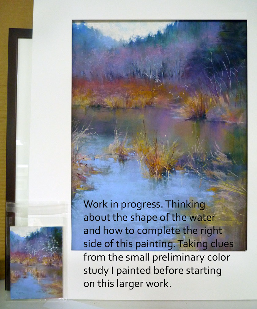
Several times during the painting of a new scene, I put a mat around my work to cut out all the marks that will not show when it is framed. I'm about 80% done with this one. The shape of the foreground water needs correcting, the lichens are only indicated....basically the right side needs resolution. The little color study I did prior to starting this larger work is a big help in deciding not only color but also keeps me on track from getting too immersed in detail.
Monday, March 12, 2012
#23 step1 pastel
I've received emails appreciating the step x steps I post on this journal so I'll try to do that with this painting. I'm working from the top down and using the little color study as my example - applying pastel on top of the oil-wash foundation shown in my last post. Each time I introduce a new color into the painting, I apply it in several places. Example: The light blue of the distant hills is repeated in the background trees and in the brightest area of the water. I feel this adds continuity in a painting. It is very distracting to me to view art that has a spot of color in one place without being able to find that color in a least one other area.
Sunday, March 11, 2012
#23 foundation
After completing the itsy-bitsy color study (see my previous post) for this painting, I unframed Mediocre Painting #23, brushed the pastel off and applied an oil-wash foundation to the Wallis paper. The size on the finished painting will be 19 x 14.5 even though I have extra paper around the edges and could make it larger. One of the goals of these 23 reworks is to pop the new work right back into the existing mat and frame. If I took advantage of the larger surface, I'd have to purchase a new frame and add the empty frame and mat to my inventory of frames which is more than adequate already.
Saturday, March 10, 2012
itsy bitsy
Thursday, March 8, 2012
23 to go
I don't know how I got into this branch thing. Well, yes I do, it started with my painting "Winter" a few weeks ago. Suddenly, as never before, I wanted to paint trees without leaves. This is another view of the Golden Gardens Park pond in Seattle. And, it is painted over an old painting.
From my art database, I separated out the paintings that I considered mediocre. That gave me a new database with 24 images to be reworked. Now I have 23 to go.
Monday, March 5, 2012
blackberry vines
Four years ago I named a painting Edge of Winter. After a couple group shows it went to one of my galleries and stayed there until I picked it up a couple weeks ago. You know what happened next...I washed it off and repainted this winter scene from a photo taken on a dog-walk with Annie and my two grandsons. This summer, a good crop of blackberries will be where last year's vines are now. This painting is titled Edge of Winter II.
Saturday, March 3, 2012
step 1
To begin applying pastel over the oil-wash foundation, I selected two "white" pastels - one cool and one warm. The cool white was applied for the sky everywhere except the upper left quarter where the light source (sun) was shining down upon this woodland scene. For that area, I applied the warm white. I also used the warm white for glow on the edge of the tree at right and lightest foliage areas. Click on the image to enlarge. These are Terry Ludwig whites - love them!
On another subject, blog subscriber Karen asked if I could explain the Kodak Color Separation Guide and Gray Scale sometimes included in my work-in-progress shots. When I photograph my work, I always include this for color reference. If the color bar doesn't look right, I know the color of the art is off. Here's the blurb from Kodak: "... Separation Guides are used as the set up guide to calibrate several digital color print systems. In addition, helps photographers compare the color of the subject with known printing colors. Also helps Graphic Arts camera operators identify separation negatives and positives for color reproduction processes. "
Thursday, March 1, 2012
foundation
This is the oil-wash foundation on Wallis sanded paper for my next Pacific Northwest woodland scene.
Tuesday, February 28, 2012
sanctuary
Finished! This was a complicated piece from a reference photo taken on one of our dog-walks. I kept the composition of the photo but pushed the color. Click on the image to enlarge for details.
Sunday, February 26, 2012
coming along
The painting on my easel is coming along - I'm working pastel back to front, top to bottom but had to put in the moss covered branch to get a feel for the yellow-green and how it plays against the other colors. Lots of digging in the garden and no painting this weekend but I'll be back to it tomorrow, Monday.
One of my blog readers emailed me asking what became of that upper right corner. Here it is now as part of the whole painting.
Friday, February 24, 2012
underpainting
I love this as a finished painting!
But it is a detail shot of the upper right corner of an oil-wash foundation...
the preparation for a pastel painting of the Pacific Northwest woods.
See the complete underpainting below.
Monday, February 20, 2012
presto, change-o!
Out with the old....I brushed off a painting to use the surface again.
Next, I applied a thin oil-wash as a loose composition of the next painting.
The finished pastel painting is another from the Golden Gardens Park, Seattle series. This one is a tangle of natural foliage along the bank of the pond. One of the goals of reworking old art is to be able to put it right back into the existing frame. I had a double mat on the original painting but this scene needed a little more room so I gained an inch all the way around by removing the bottom mat. The window is now 14.5 x 14.5 inches. The title is "Forsaken."
Thursday, February 16, 2012
winter pond
This is my impression of the pond at Golden Gardens Park in Seattle. For this 25 x 25 inch painting (large for me), I started at the top and worked down instead of skipping all over.
Tuesday, February 7, 2012
thrice
This is another scene of our driveway. I've painted it twice before as "Light Show II" and "The Good Road Home." This version was painted more quickly because it is smaller than the other two and has a more abstract feel. "Sunset" is 8.25 x 8.25 inches. The top photo shows the reference photo and the painting as an oil foundation before any pastel was applied. I'm using the paper of an old painting - I think it is 140lb Lanaquarelle watercolor paper covered with red pumice gesso mixture.
Monday, February 6, 2012
know when to walk away
This isn't the first time I've titled a blog post "know when to walk away." When I hear the lyrics of The Gambler begin to play in my head, I try to heed the advice and step away from the easel. I've been working slow and steady on this 25 x 25 inch painting with no major setbacks or wipe offs. I'm very happy with it but it is good to be finished and to be able to move on to the next one I have in mind that will be a very different palette.
Thursday, February 2, 2012
grayscale and noseprints
I'm working on another painting of the dog park. I thought I better check my values against the reference photo to get the mood right. Photographing your work-in-progress and changing the image to grayscale is very helpful. While I work, Annie is doing her own noseprint painting on the studio window.
Subscribe to:
Posts (Atom)